Precision Check
Assess color contrast with precision and efficiency. This checker delivers accurate ratio calculations, supporting clear presentation and consistent visual hierarchy across all digital environments.
Ready for Accessible
Design That Stands Out?
Use for standard paragraphs and body copy to maintain readability, support accessibility, and ensure consistent presentation across digital platforms.
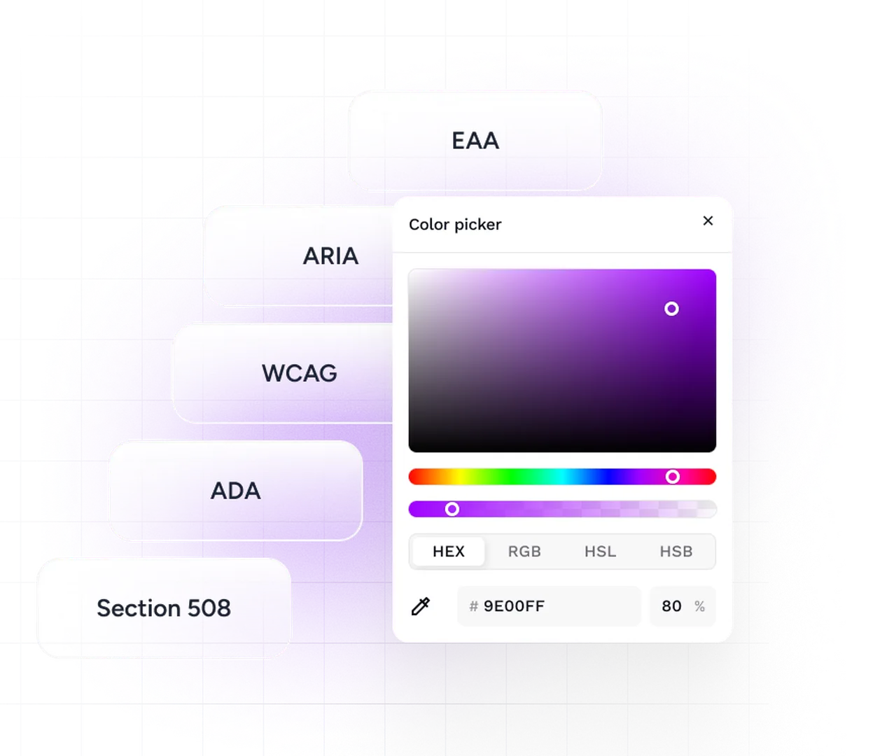
Contrast Ratio
--Check text visibility across common color vision deficiencies.


The Challenge
Color vision deficiencies impact millions worldwide, making text and visuals difficult to interpret. Without careful design, readability suffers. Addressing these conditions ensures accessibility, supports compliance with WCAG standards, and delivers clear, effective digital experiences that work for every user.
The Solution
Our Contrast Checker helps you evaluate color combinations with speed and accuracy. We focus on clarity so your projects remain consistent and easy to read.
With real-time ratio calculations, you get dependable data to guide your design choices. This gives your team confidence while keeping the process efficient and straightforward.
We also align our approach with WCAG 2.2, the Web Content Accessibility Guidelines. These international standards outline clear benchmarks for contrast, allowing you to create digital experiences that feel polished, reliable, and professional.
Reach Out

Your dream project deserves more than a template. Let us build something people will remember.
Your Future Website Starts Here
FAQs
Our Contrast Checker is built for speed, accuracy, and everyday practicality. This section provides clear answers to common questions so you can use the tool with confidence and
get the most out of every project.
Have a project in mind? Let’s make it happen.

It measures contrast between text and backgrounds in seconds, delivering results that strengthen readability. Request a review today to validate color choices with confidence.
The checker aligns with global accessibility benchmarks, including WCAG 2.2. Book a compliance service now to keep your projects aligned with recognized standards.
It applies official contrast ratio formulas to provide reliable calculations. Secure accurate results today to support decisions and reduce uncertainty in creative workflows.
The tool is built for designers, developers, and compliance officers. It ensures projects meet standards without guesswork. Book a compliance service today to protect digital experiences and avoid costly accessibility issues.
Yes, the tool simulates multiple color vision deficiencies including Protanopia, Deuteranopia, Tritanopia, and Achromatopsia. Request a professional check to ensure designs remain effective for all users.
Absolutely. The Contrast Checker delivers consistent, reliable results for small teams or large organizations. Contact us to scale accessibility services across enterprise-level projects.
The tool provides instant results for any color pairing. It’s built for speed without sacrificing accuracy. Order a compliance check to keep projects moving while maintaining accessibility standards.
Clear ratio data helps validate creative choices and supports compliance reporting. Gain clarity with data that backs every decision. This added layer of credibility strengthens both internal reviews and external presentations.
The checker allows repeated testing across numerous color combinations. It’s built for flexibility and ease. Request ongoing compliance checks across all visual elements to ensure WCAG 2.2 standards are met.
It combines speed, accuracy, and professional reliability in a single solution. Invest in proven results today to maintain clarity across all digital projects.
Your Next Step
Safeguard your digital projects with the WCAG 2.2 Contrast Checker. Ensure accuracy, reduce liability, and maintain clarity across every environment with one reliable, professional-grade tool.