Home Media Pantheon Blog 7 Deadly Sins Represented with Web Design Colors
Table of Contents


Foued
14 Min Read
Color is more than decoration. It’s a silent influencer that controls emotions, navigational flow, and even purchasing decisions. In web design, the right color evokes trust and engagement.
The wrong one? It can cause friction, confusion, or even drive users away. What if we told you the psychological impact of color goes deeper and aligns directly with humanity’s oldest narratives?
The 7 deadly sins, which include pride, greed, wrath, envy, lust, gluttony, and sloth, aren’t just moral categories. They’ve become symbolic pillars in culture, advertising, and now, web design. Each sin carries emotional weight, and colors that mirror these sins can create powerful emotional triggers online.
This article dives into how each deadly sin is represented through color psychology in web design. We’ll explore the impact these choices have on user behavior, accessibility, branding, and emotional influence. You’ll learn how to use sin-based palettes to inspire action, raise tension, or convey mood without alienating users.
Color shapes how we feel before we even know why. It speaks to us in ways words can’t. We’re here to decode its most ancient vocabulary one sin after another.
Each deadly sin is tied to a color that triggers specific emotions: red for wrath, gold for greed, gray-blue for sloth, purple for pride, pink for lust, green for envy, and orange for gluttony. These guide intuitive, emotionally driven web experiences.
From crimson for wrath to green for envy, these colors carry instinctual associations across cultures. When integrated with purpose, they can enhance storytelling, drive conversion, and build emotional bridges with users. When abused, they can overwhelm and disrupt clarity.
Understanding the power of sin-inspired colors allows designers to break from generic palettes. Instead of choosing colors based solely on aesthetics, designers can layer in symbolic relevance. This approach supports stronger messaging, emotional continuity, and audience connection.
For example, using purple (often tied to pride) on a luxury landing page may reinforce a brand’s elite positioning. Meanwhile, using red to signify urgency or risk taps into primal instincts. These choices aren’t just beautiful; they’re strategic.
Thoughtfully applied symbolic color strategies can elevate a brand’s message while meeting WCAG 2.2 AAA accessibility standards. We’ve successfully implemented this approach across many of our projects to create expressive and accessible designs. In the next section, we’ll explore how sin-based color choices go beyond aesthetics to influence user experience and behavior
Sin-themed colors affect how users feel fast. Red triggers urgency, green suggests envy, purple adds pride, pink evokes lust, gold shows gluttony, yellow hints at greed, and gray brings sloth. Designers use them to guide actions without confusion.
Red ignites urgency or anger, purple conveys elitism or mystery, and green can soothe or signal jealousy depending on saturation. These effects are not arbitrary. Cognitive psychology links color and emotion tightly, especially in digital environments.
In user experience (UX) design, these emotional reactions must be guided. Overuse of wrath-associated red can lead to visual fatigue or anxiety. On the other hand, small touches of red in buttons or warnings drive clarity and urgency. It all comes down to finding the right balance that feels natural, not forced.
Strategic use of sin-based hues also strengthens navigation. Gluttony-themed indulgent pinks and golds may draw attention to high-value products. Sloth’s dull grays and muted blues slow the pace, useful for reflection-based content or calm onboarding flows.
The key is not to embody the sin in total, but to echo it subtly in tone and intention. When applied with care, this approach creates smooth, emotionally aligned experiences that guide users with precision. The following section explores how to apply sin-inspired colors thoughtfully without overwhelming or alienating your audience.
Applying sin colors without alienating users means balancing contrast, using subtle accents, and considering cultural meaning. This approach keeps designs emotionally engaging while remaining comfortable and accessible for all audiences.
Using wrath’s red as a background can cause discomfort, while the same red as a subtle accent can energize a call to action. Accessibility guidelines like WCAG require sufficient contrast, meaning colors tied to sins need tuning to avoid usability violations.
Here’s a breakdown of adjustments that can help:
| Sin | Base Color | Color Code | Adjustment Tip | Emotional Outcome |
| Pride | Purple | #800080 | Use lavender accents, avoid neon | Regal, inspirational |
| Envy | Green | #228B22 | Use cool tones, add white space | Fresh, focused |
| Wrath | Red | #B22222 | Limit to Call To Actions, avoid backgrounds | Alert, urgent |
| Sloth | Gray | #708090 | Add blue tint, animate slowly | Calm, restful |
| Lust | Pink | #C71585 | Use deep pinks, reduce saturation | Romantic, bold |
| Gluttony | Gold | #FFD700 | Pair with dark blue for balance | Rich, appetizing |
| Greed | Yellow | #CCCC00 | Desaturate slightly, add black | Wealth, caution |
Keeping color use context-aware avoids alienating those with visual sensitivities or different cultural interpretations. For example, while red signals danger in Western cultures, it symbolizes prosperity in many Asian contexts.
Sin-based colors mean different things worldwide. Purple shows royalty in the West but mourning in Brazil. Green means luck in Ireland but danger in Indonesia. Knowing these meanings helps create designs that connect across cultures.
Colors are powerful cultural signals. When linked to the 7 deadly sins, their meanings can shift dramatically depending on the region. Smart design requires knowing how each is perceived.
Purple, often linked to pride, symbolizes royalty and ambition in Europe and the U.S. In Brazil and Thailand, it is worn at funerals and tied to grief and loss.
Green, representing envy, stands for luck and growth in Ireland and Japan. In Indonesia, some areas avoid it due to spiritual restrictions, and it may signal danger.
Red, the color of wrath, means danger and passion in the West. In China, red brings happiness, success, and festive energy. It is positive and used widely in celebrations.
Gray, connected to sloth, is viewed as dull or passive in Western countries. In Japan, gray is formal and sophisticated. Its meaning depends on context and usage.
Pink, associated with lust, suggests romance and love in the West. In South Korea, it represents trust and care. In many Middle Eastern cultures, it may hold little or no emotional value.
Gold, symbolizing gluttony, implies luxury and excess in Western design. In Hindu and Buddhist traditions, gold is sacred and linked to divine power and enlightenment.
Yellow, reflecting greed, is a warning color in the U.S. and Europe. In Egypt, it is used for mourning. In Japan, it stands for courage and heroism, not selfishness.
Designers should choose colors with cultural awareness. Each sin’s palette tells a different story depending on the viewer’s background. Respecting these meanings leads to stronger and more impactful design. The following section explores the academic research behind color psychology to better understand these emotional and cultural effects.
Studies confirm color changes how people think and feel. Red helps with detail tasks, blue with creativity. These insights support using sin-inspired colors to build emotional, persuasive, and goal-driven digital experiences.
For example, Mehta and Zhu at the University of British Columbia, in a study, found that red induces avoidance motivation, which improves performance on detail-oriented tasks, while blue promotes approach motivation, enhancing creativity and calm.
The University of Rochester showed that men exposed to red-rated women are more attractive, linking color directly to romantic emotion.
These are not marketing guesses; they’re empirical truths. That’s why sin-based color strategies don’t just “feel” powerful. They are powerful.
By using data-backed color theory, designers move from trend-following to persuasion science. They can create friction or flow, tension or trust simply by adjusting hue, saturation, and
Skilled web designers go beyond knowing color theory. They understand emotional neuroarchitecture, using design to guide how people feel, focus, and act.
This understanding becomes especially powerful when applied to branding, as we’ll now explore through the use of sin-based color strategies across different industries.
Brands use sin-inspired colors to trigger emotion. Gold signals richness, green freshness, gray professionalism, red boldness, yellow friendliness, purple royalty, and pink passion. These colors boost attention, influence mood, and build loyalty.
Let’s look at some examples of how major brands use sin-associated colors to influence perception and emotion.

Used by Hallmark and Cadbury, the color purple is often associated with pride. It evokes feelings of royalty, luxury, and sophistication, making it ideal for brands that want to position themselves as elegant, premium, or emotionally rich in their messaging.

Used by McDonald’s and Snapchat, yellow is linked to greed and grabs attention quickly. It conveys energy, urgency, and friendliness, making it ideal for attracting users’ eyes and prompting fast interactions or spontaneous decisions.

Used by Coca-Cola and YouTube, red is associated with wrath and creates bold, intense engagement. It stimulates strong emotions, increases urgency, and is effective for drawing focus to key actions like play buttons or promotional content.

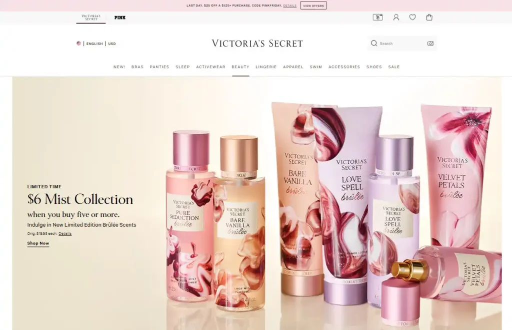
Used by Victoria’s Secret, pink is associated with lust and conveys a sense of romantic allure. It evokes feelings of passion, intimacy, and desire, making it a powerful choice for brands focused on beauty, fashion, or emotional appeal.

Used by Spotify and Starbucks, green is associated with envy and symbolizes freshness and balance. It evokes growth, harmony, and renewal, making it ideal for brands that focus on wellness, sustainability, or calm and focused user experiences.

Used by Apple and LinkedIn, gray is associated with sloth and conveys a neutral, calming effect. It promotes simplicity, stability, and professionalism, making it ideal for minimal interfaces, focused content, and distraction-free digital environments.

Used by Godiva and Lindt, gold is associated with gluttony and represents indulgence and richness. It evokes luxury, appetite, and premium quality, making it a powerful choice for brands aiming to deliver a sense of reward, opulence, or gourmet experience.
Web design borrows these same cues to align emotion and intention. It’s not just about standing out; it’s about creating an immediate emotional connection that feels intentional and compelling. To understand how this impacts results, we’ll now look at whether symbolic sin colors can actually improve engagement or conversions.
Symbolic sin colors can improve engagement or conversions when used with purpose. They help users feel something quickly, like urgency from red or trust from green. When combined with good layout and messaging, they encourage more clicks and actions.
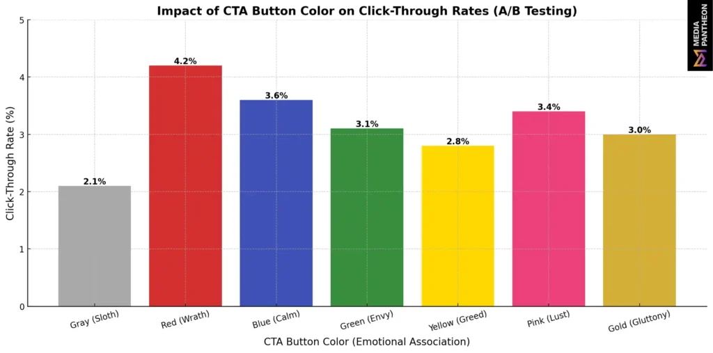
Designers can’t afford to guess which colors convert best. Analytics-driven A/B testing shows that slight changes, like turning a Call to Action from gray (sloth) to red (wrath), can double click-through rates. The emotion behind the color primes the user for action.

Image: Impact of CTA Button Color on Click-Through Rates
This chart shows how different color choices impact click-through rates, with red and pink driving higher engagement and gray underperforming due to its passive tone.
To make the most of symbolic palettes:
Just like sins themselves, too much indulgence leads to chaos. But when these emotional triggers are applied with care, they can produce powerful results.
Striking this balance is not only about aesthetics. It directly affects how users navigate and understand a site, which makes accessibility and visual hierarchy essential to get right.
Sin colors impact accessibility and hierarchy by guiding attention or causing confusion. Using strong contrast, clear roles, and limited intensity helps sin tones support structure while keeping the design readable, focused, and emotionally effective.
Here’s how to apply sin-themed colors effectively without compromising accessibility or visual clarity:
List of key hierarchy tips:
By combining hierarchy with accessible contrast, sin tones can intuitively guide users from entry point to conversion with clarity and emotional precision.
This balance becomes even more important when considering whether to design around a single dominant sin-themed color, which raises deeper questions about focus, brand mood, and user impact.
Using one sin-themed color can create strong emotional impact and brand recall, but it also risks overstimulation and readability issues. Balancing it with neutral tones and clear structure keeps the design effective, focused, and visually clear.
Landing pages built on a single sin’s palette, such as passion-themed pages for beauty products or envy-green themes for eco-products create immersive experiences. But they must be carefully structured.
| Benefits of Using a Single Sin-Themed Color | Risks of Using a Single Sin-Themed Color |
| Cohesive emotional tone | Overstimulation |
| Strong brand recall | Accessibility issues |
| Easy A/B testing | User fatigue |
| Faster emotional engagement | Misinterpretation across cultures |
| Visually striking, memorable layouts | Unintended psychological triggers |
| Enhances storytelling and mood | Reduced readability if overused |
| Clear visual identity | Can alienate specific user groups |
| Boosts campaign consistency | Low performance in low-contrast UI |
Best practice: Balance sin with restraint. Use the sin color as the dominant tone, but soften it with white space, neutral backgrounds, and subtle gradients. This keeps the design clear and accessible while maintaining emotional impact.
Understanding how these colors work within the broader rules of visual harmony is critical. That’s where color theory in web design comes in and why it is the foundation of smart, emotionally resonant digital experiences.
Color theory helps designers create visual harmony, clear contrast, and emotional consistency on websites. It guides how colors work together to attract attention, support usability, and shape how users feel and respond.
Primary colors, complementary contrasts, warm vs. cool tones all play a role in guiding perception. When designing sin-themed pages, color theory ensures emotional tones don’t clash.
Analogous colors (adjacent on the color wheel) create softness. Complementary colors (opposite on the wheel) create drama. Designers use this theory to control attention flow.
For instance, pairing lustful pink with calming teal balances energy. Using greed-yellow with charcoal creates depth. Understanding the wheel lets designers shape mood, clarity, and accessibility all at once.
Choosing the right color goes beyond theory. It requires considering multiple factors that affect branding, functionality, and accessibility. Let’s look at what matters most when selecting colors for your website.
Choosing web colors means thinking beyond looks. Consider audience age, cultural meaning, readability, and conversion data to create a palette that connects emotionally and performs effectively across users and regions.
Don’t just pick sin-themed colors because they look exciting. Consider:
Color isn’t just something we see. It’s something we feel. The most effective web palettes aren’t the flashiest or the most popular. They are chosen with purpose, designed to connect with people, guide their attention, and inspire action.
Each of the 7 deadly sins connects to a distinct color that stirs emotion, shifts perception, and drives action. Designers can leverage these symbolic hues to craft psychologically charged, immersive web experiences that align with core human instincts.
Understanding sin colors isn’t about morality. It’s about emotion. Design always says something, even when it seems quiet. With the right colors, your site doesn’t just appear on a screen. It creates a feeling, connects with people, and gently guides them to act.
By integrating sin-inspired color strategies with accessibility and intention, designers can move beyond surface-level aesthetics. These choices become tools for emotional storytelling, brand memorability, and meaningful user engagement
About Foued
Foued is the CEO of Media Pantheon, Inc., a full-stack developer, web accessibility expert, and the technical lead behind 1,000+ website builds worldwide. Fluent in English, German, French, and Arabic, he and his team deliver fast, secure, and scalable digital experiences engineered for long-term growth.


Our Work, Your Inspiration
Suggested Blogs
Explore the projects that showcase our expertise and creativity. From innovative designs to robust functionalities, our portfolio reflects the success
Get Started