
Every movement of the page defines how users consume information, notice details, and decide where to focus. Unlike clicks or taps, scrolling happens continuously and shapes the entire journey from the first line to the last.
Websites that treat scrolling as a passive action often feel flat. In contrast, websites that enhance scrolling with motion, layering, and dynamic transitions turn navigation into an experience.
These effects act as signals that guide attention, emphasize key content, and keep users engaged longer.
Research from Missouri S&T shows that visitors form impressions of websites in under 0.2 seconds.
The way a page responds to movement influences that split-second judgment. Smooth and responsive scrolling suggests professionalism, while static or clunky movement can feel outdated.
The growing use of interactive design has made scroll effects part of modern web expectations. From subtle fades that reveal text to complex depth illusions that simulate three-dimensional space, scroll effects shape perception before a single message is read.
To create a scroll effect, build clean HTML, style with CSS transitions like opacity or transform, and use JavaScript or libraries such as GreenSock Animation Platform or Animate (GSAP) On Scroll to trigger animations.
Scroll effects begin with planning. Decide what needs emphasis: text sections, images, or buttons. A good effect enhances readability and flow. The simplest way is to use CSS transitions like fade-in or slide-up as content becomes visible.
For more advanced features, JavaScript is essential. JavaScript can detect scroll position and activate animations when elements enter the viewport.
Libraries like GreenSock Animation Platform or Animate On Scroll provide tools for smoother animations without heavy coding. For a quick start, you can follow the steps below to create a basic scroll effect.
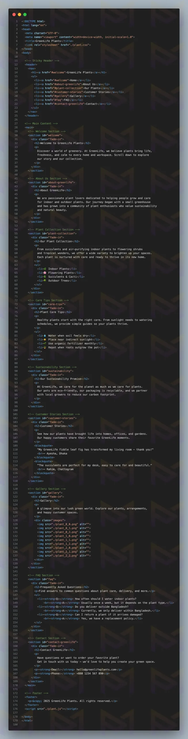
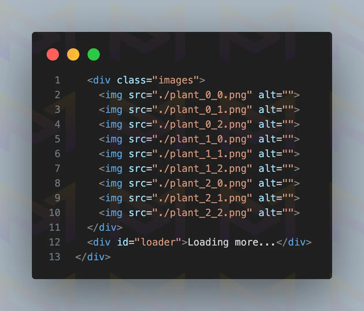
Image: A demo HTML code for a plant website with a simple layout.
Styling the site with CSS will make it look prettier and cleaner. So, add a little styling as you like and give the selected elements a transition effect.
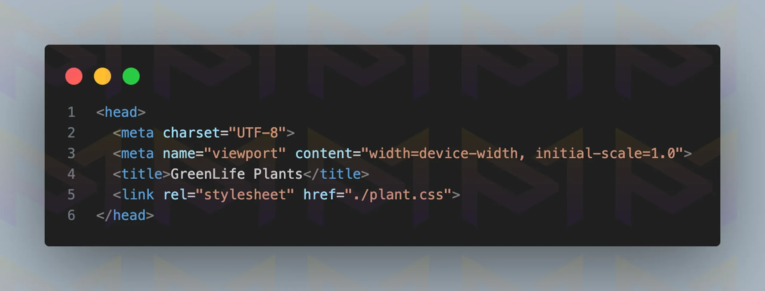
Link the CSS file to your HTML by adding the <link> element in the <head> section, as shown in the image above.
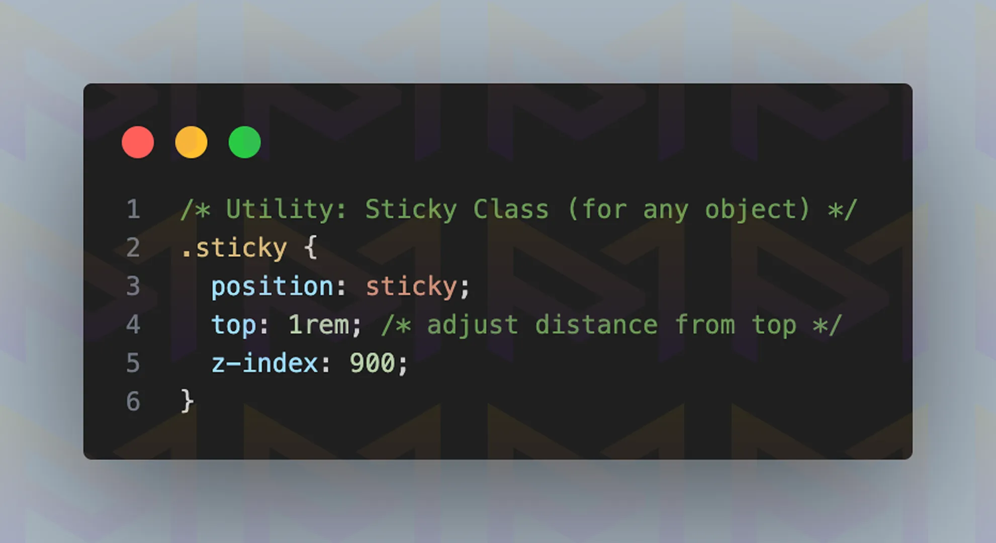
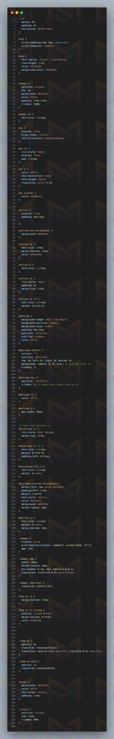
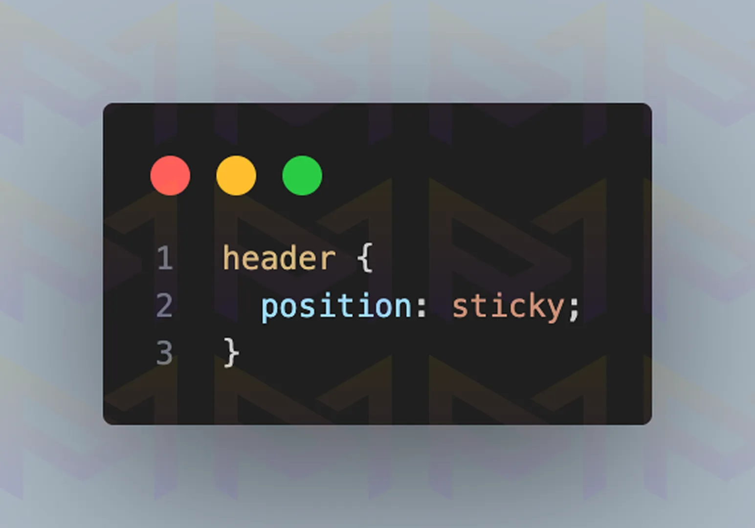
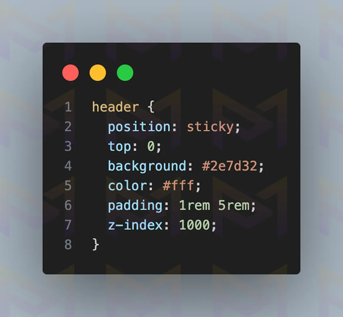
After linking your CSS file to your HTML code, add the code above to your CSS file. The position: sticky; property keeps the section fixed to your screen when you scroll.
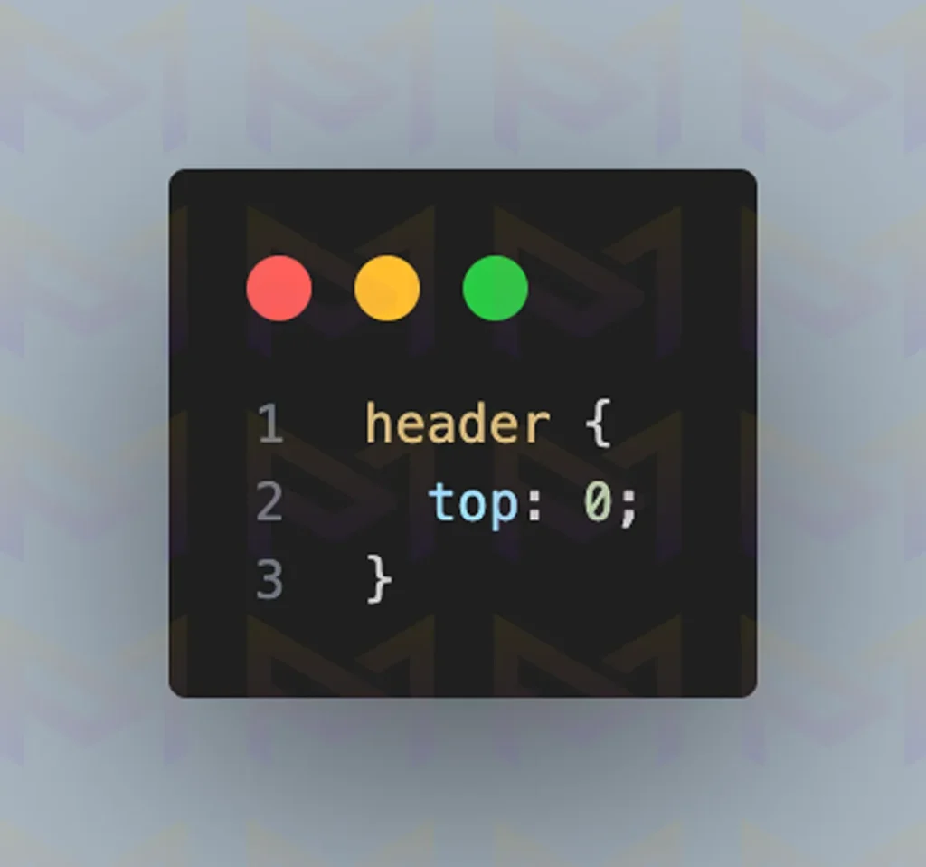
You can adjust the position using the top, bottom, left, and right properties. For example, top: 0; sticks your element to the top of the screen. The position property creates a layer on your site, so z-index helps determine which elements stay above others.
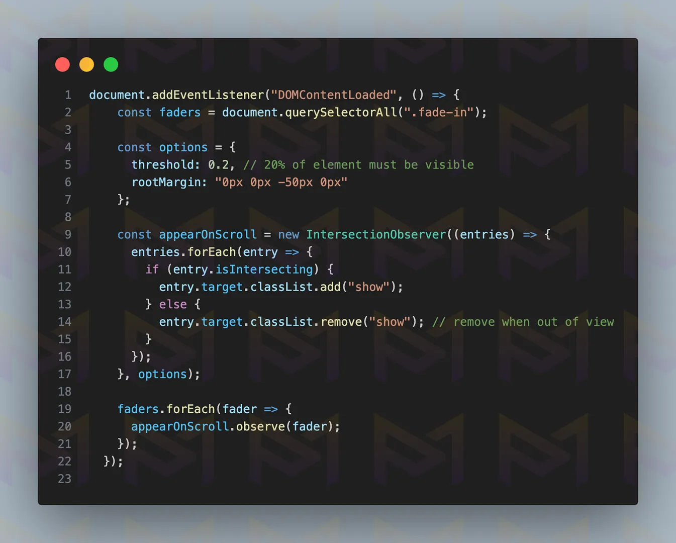
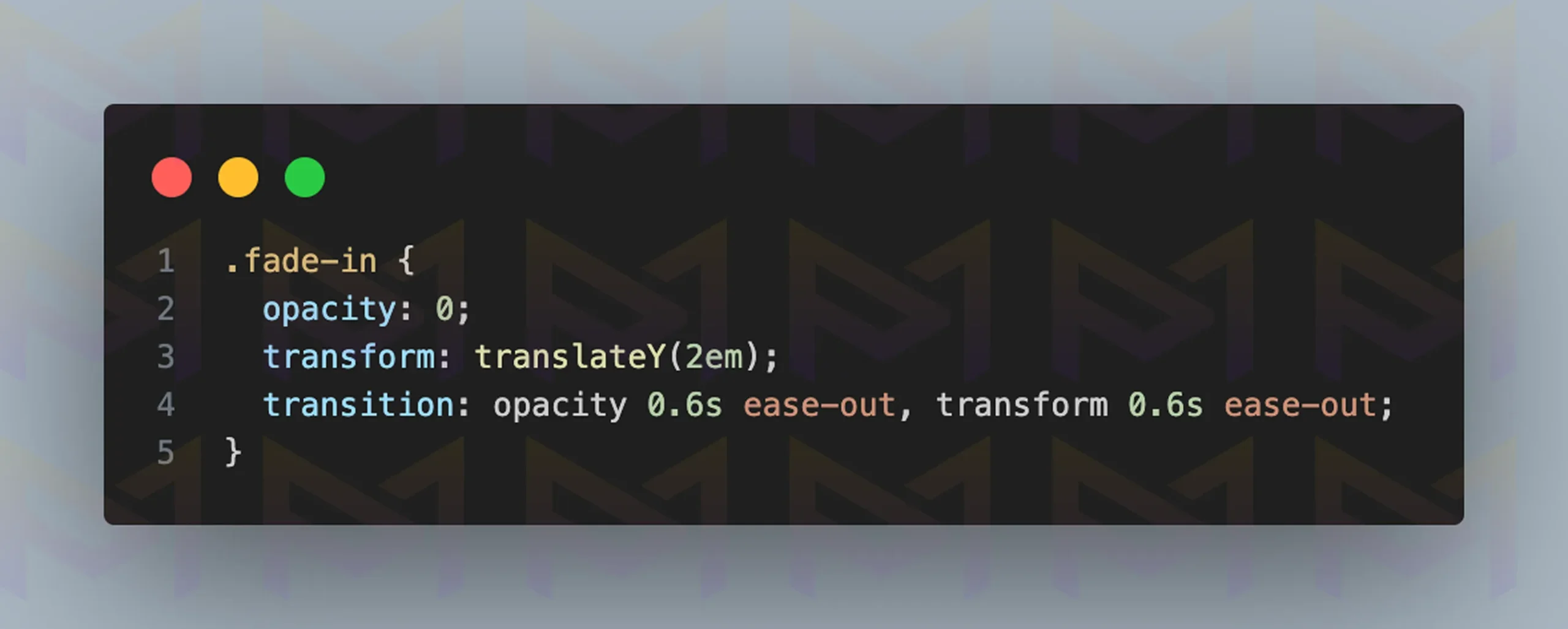
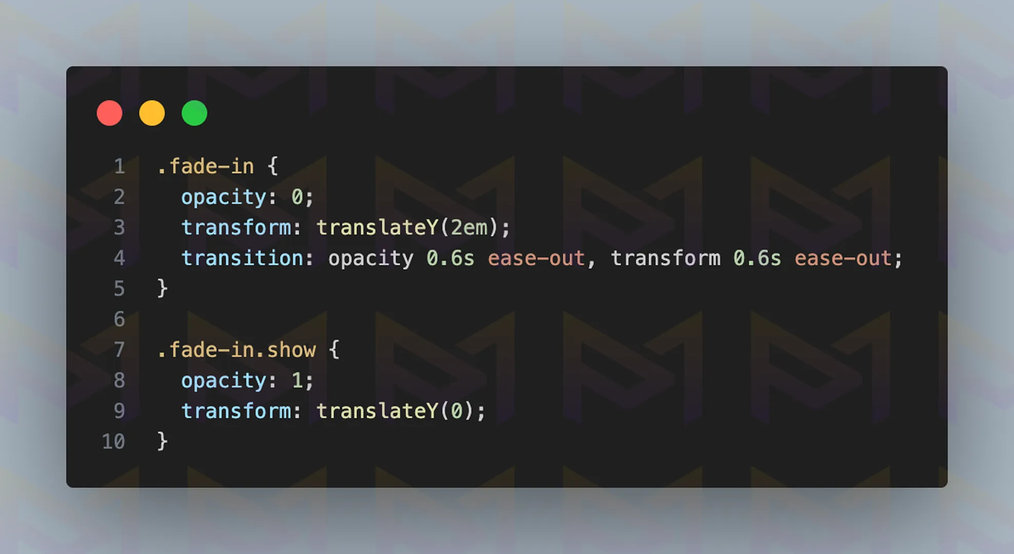
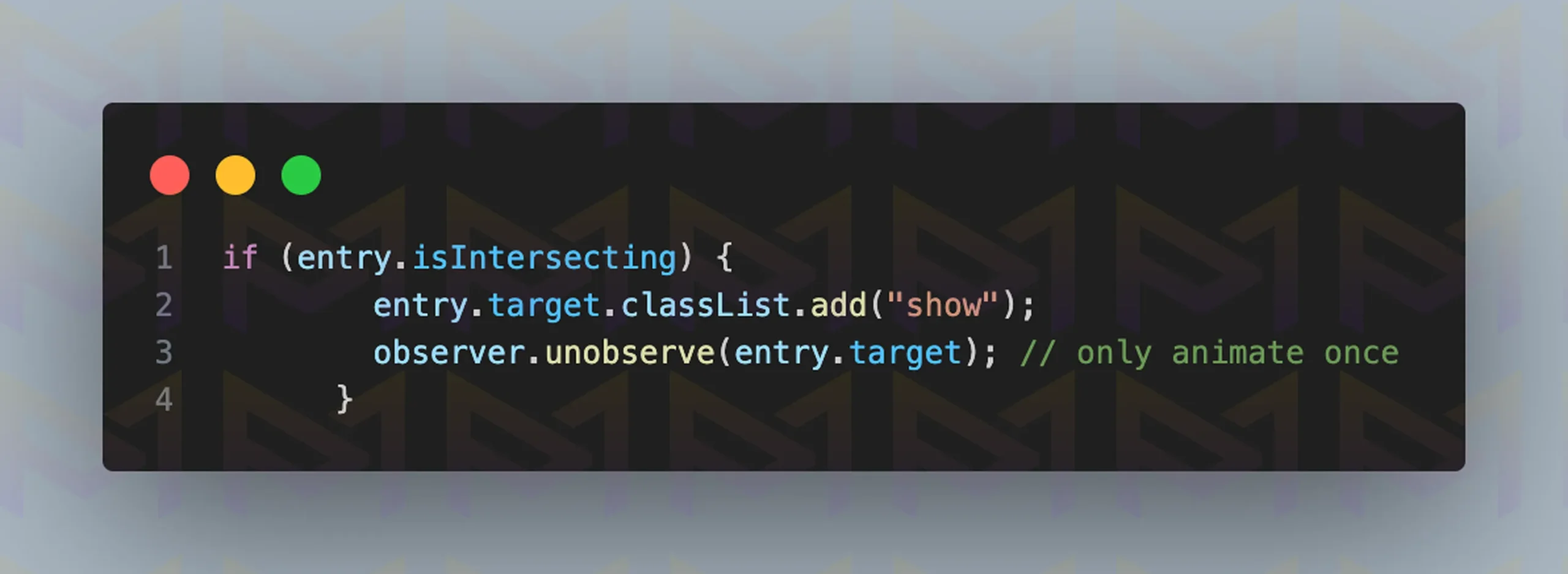
You can create dynamic effects and a smoother experience while scrolling the site by using JavaScript. The code shown above creates a fade-in and fade-out effect when a section comes into or goes out of view.
After developing the site, you should always test it across different browsers and devices.
Image: Website on Google Chrome
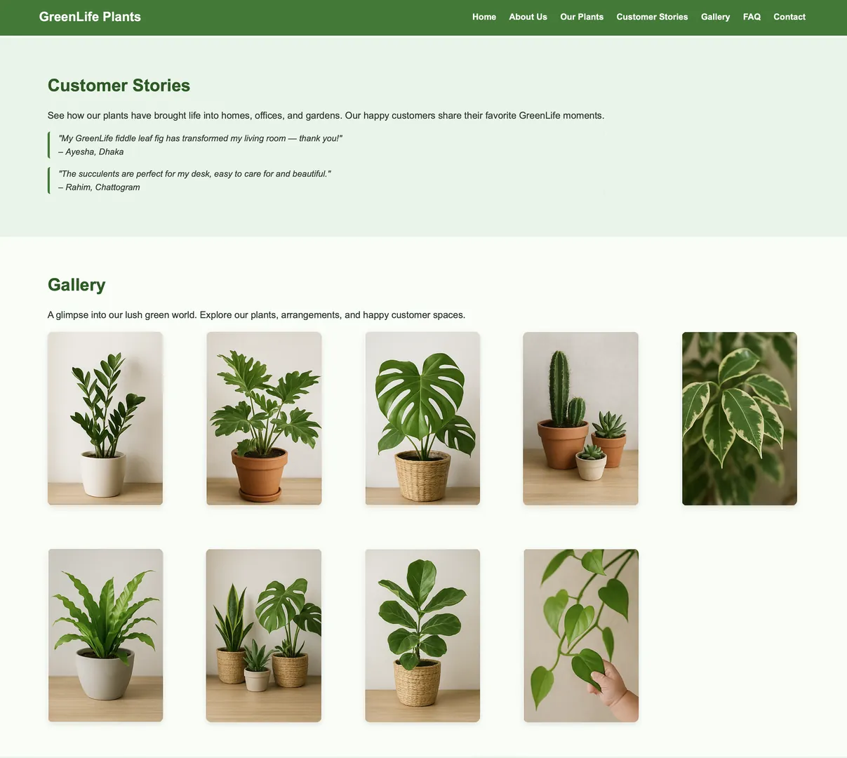
Image: Website on Safari
By combining CSS and JavaScript, developers create effects that engage without distracting. Proper testing ensures smooth performance across different screen sizes and operating systems.
Among the most popular and impactful techniques is parallax scrolling, which adds depth and visual interest to modern websites.
Parallax scrolling makes backgrounds move slower than foregrounds to create depth and immersion. Add it by layering HTML, styling with CSS transforms, or using JavaScript libraries for smooth control.
Parallax scrolling is widely used for modern websites because it adds a cinematic quality. The effect simulates depth, making backgrounds feel distant while the foreground moves naturally.
This creates a layered, three-dimensional illusion. The steps to add parallax scrolling are outlined below.

The hero section has a background image, and above it, there is content. Therefore, it is considered a layered section.
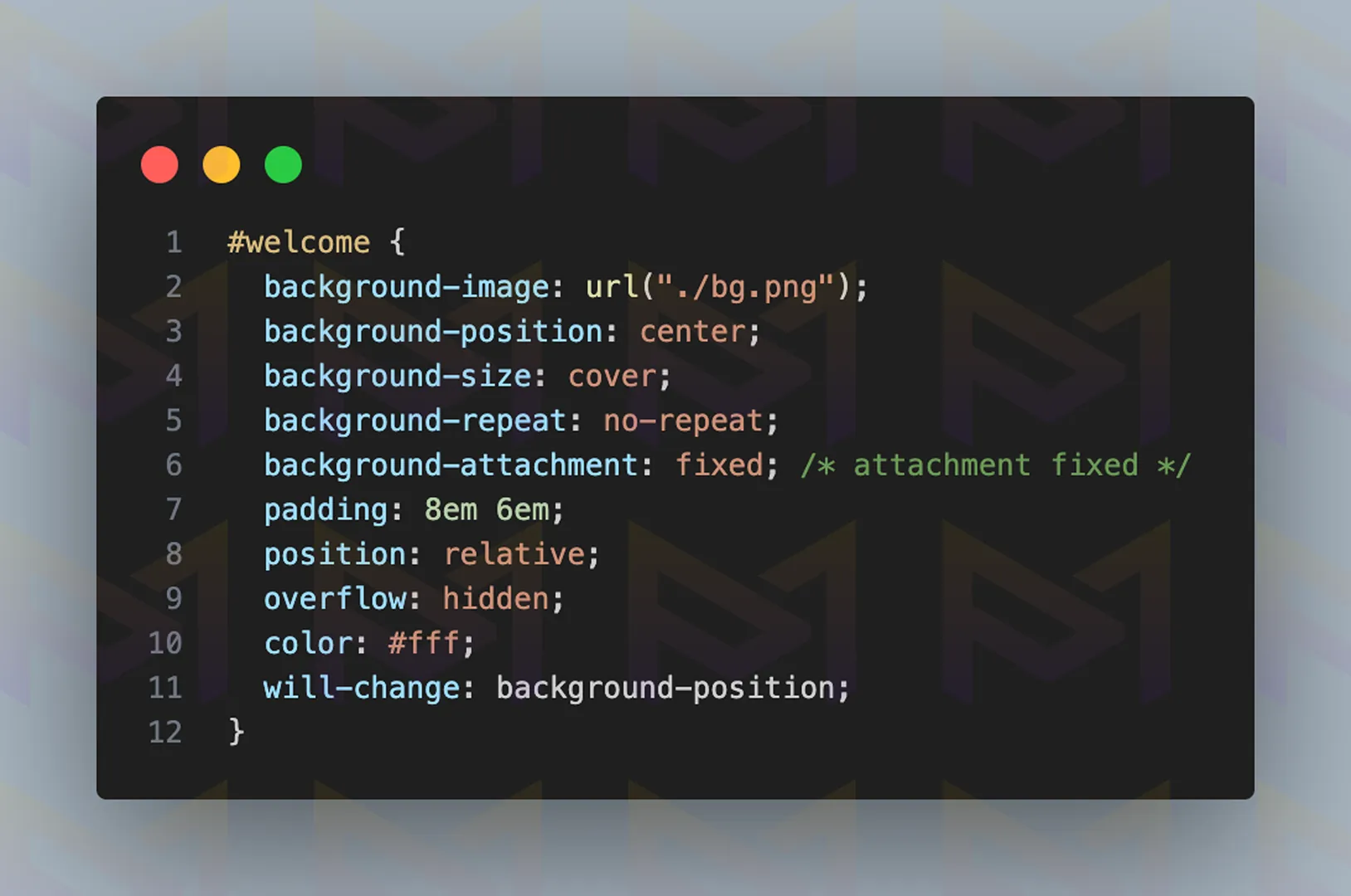
background-attachment: fixed; keeps the background image fixed relative to the viewport, so it doesn’t scroll with the page. This creates a parallax-like effect where the content moves while the background stays still.
However, it is not recommended; use it sparingly, as it can cause performance issues on mobile devices. If you decide to use it, apply it with background-size: cover; for the best results.
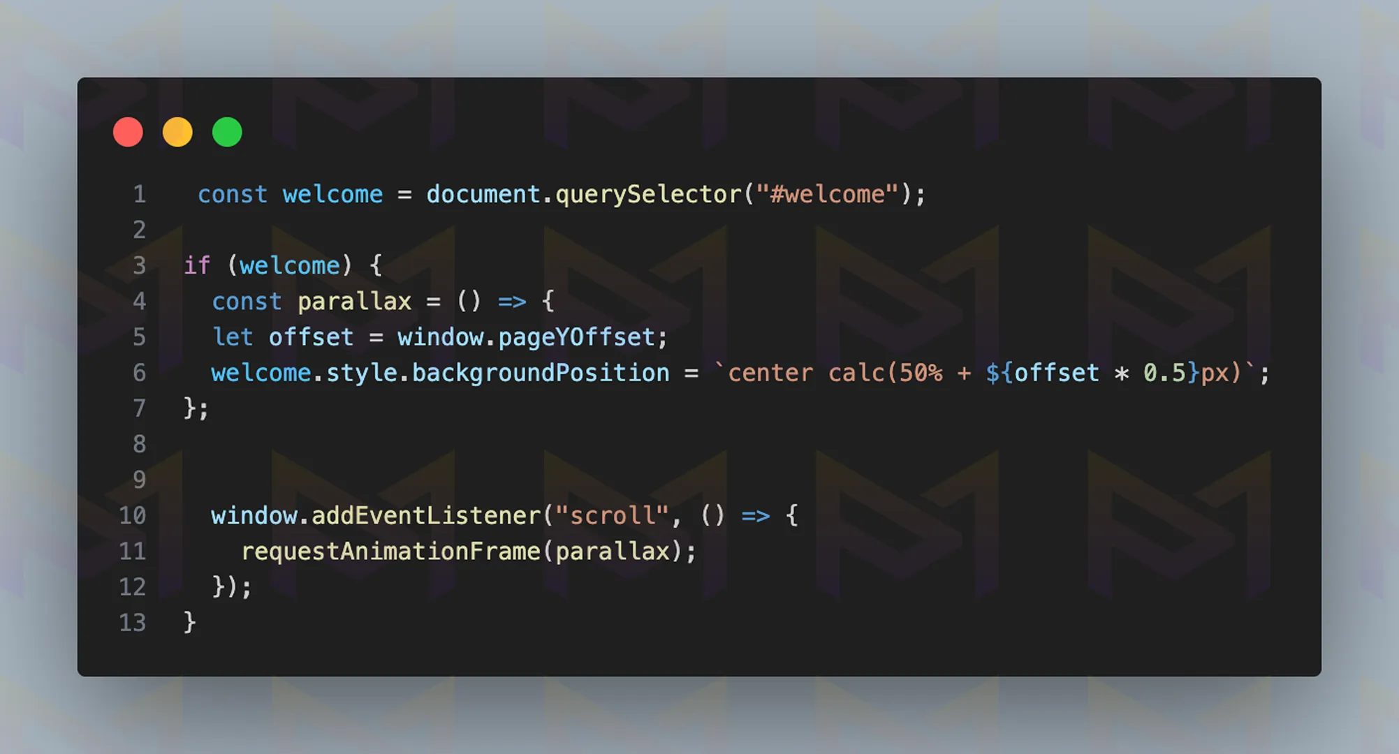
You can also achieve this effect with JavaScript. The code above makes the background image of the section move more slowly than the page when you scroll, creating a smooth parallax effect.
translateY() moves an element vertically along the Y-axis without affecting its surrounding layout. It is often used for smooth animations, parallax scrolling, or layering effects.
Combine it with CSS transitions or scroll-triggered JavaScript for dynamic motion.
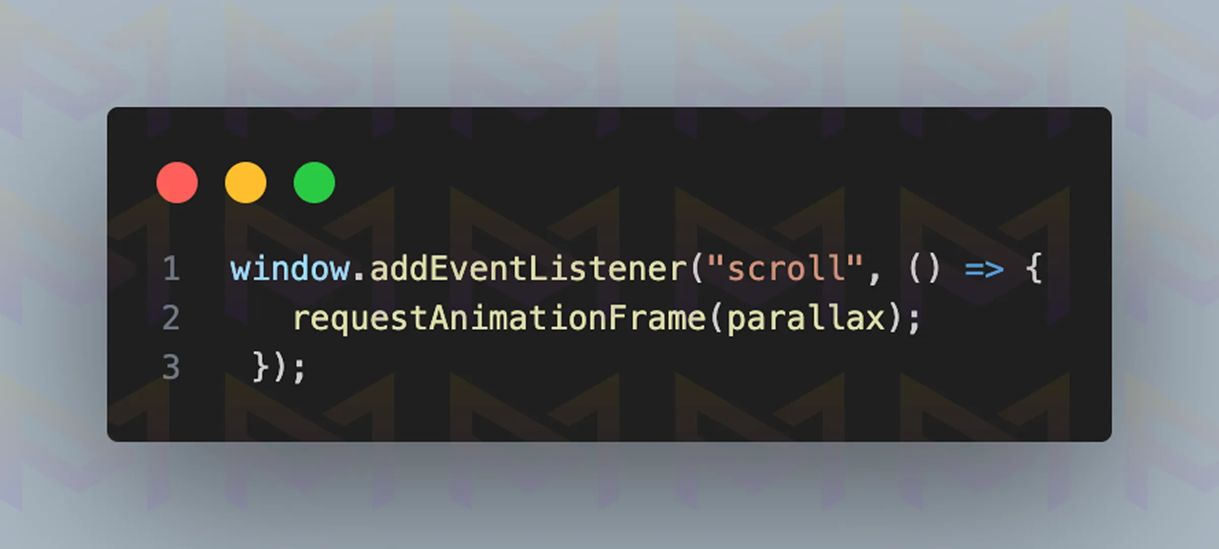
Use requestAnimationFrame(parallax); to make the parallax background scroll smoothly instead of jittering.
Additionally, to improve the scrolling experience, add the CSS code shown above.
Use requestAnimationFrame(parallax); to make the parallax background scroll smooth instead of jittery. Additionally, for a better scrolling experience, add the CSS code from above.
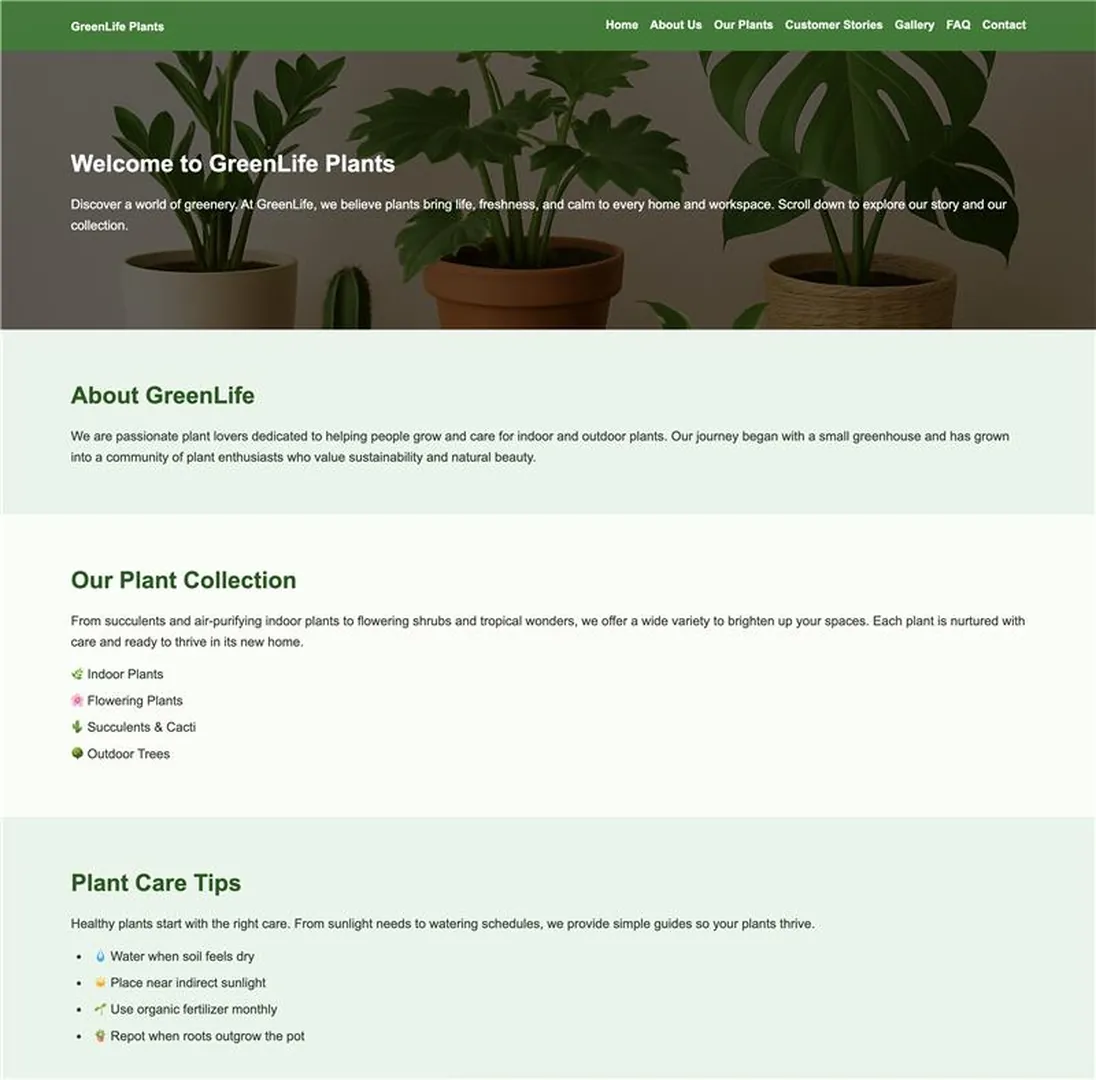
Image: The website displayed on a desktop screen

Image: The website displayed on a mobile screen
Before choosing an approach, compare how each method affects complexity, control, and performance on your site. The table below summarizes popular options, the tools you will use, the skill level required, and the performance you can expect.
| Method | Tools | Difficulty | Performance |
| CSS background-attachment | Pure CSS | Easy | Good |
| Transform with translate | CSS and JavaScript | Medium | Great |
| Rellax.js library | JavaScript | Advanced | Smooth |
When used with restraint, parallax effects add depth and bring stories to life. They shine on landing pages, portfolios, and creative campaigns, but overuse can harm performance.
Smooth scrolling builds on this idea by making navigation itself feel natural and fluid, keeping users engaged as they move through content.
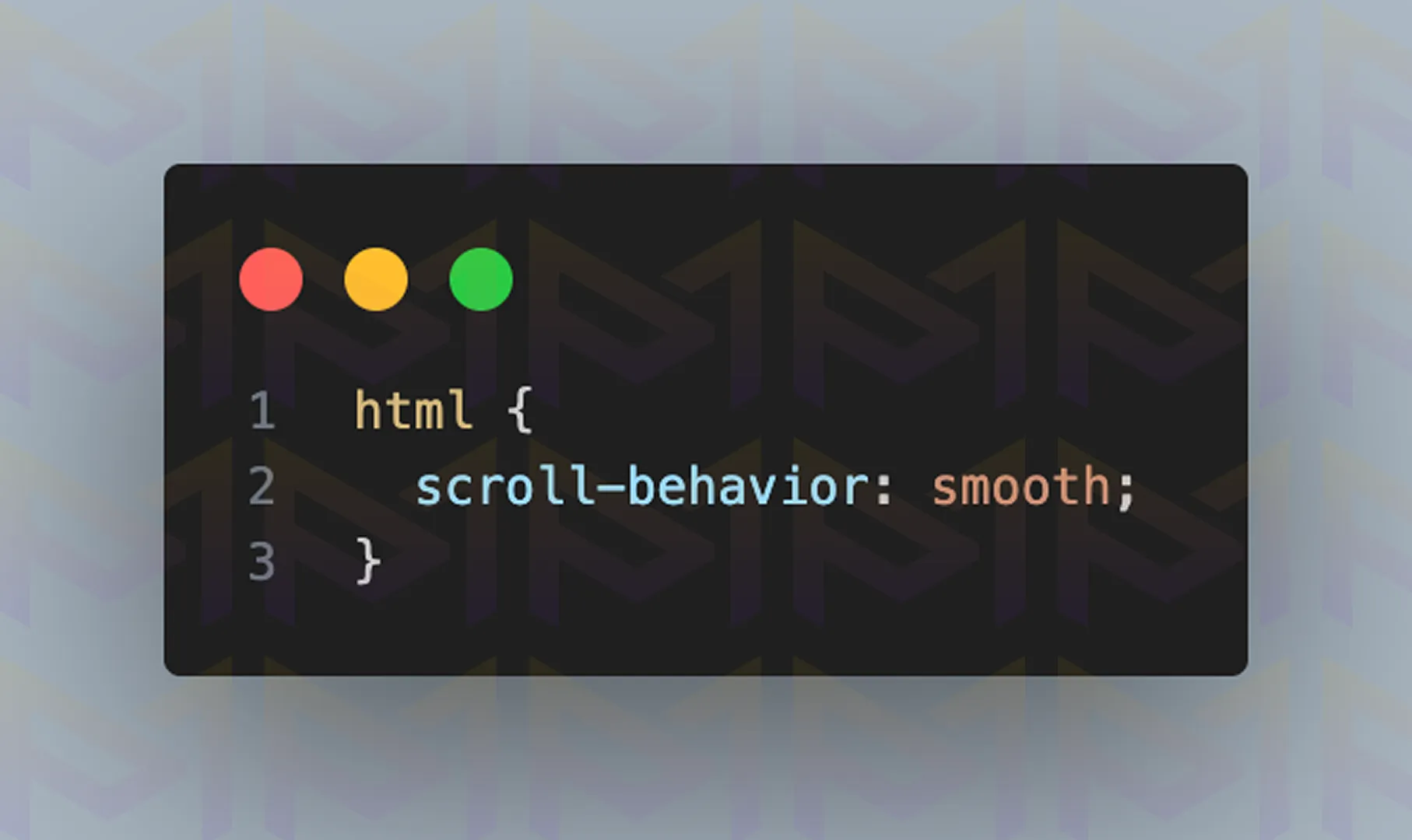
Smooth scrolling makes navigation fluid by easing movement between sections. You can implement it by adding scroll-behavior: smooth in CSS or by using JavaScript functions and libraries for advanced control.
Smooth scrolling helps users move comfortably across sections. Instead of abrupt jumps, the screen glides into position.
This makes websites easier to read and prevents users from losing track of their location. To create this experience on your site, follow the steps below to enable smooth scrolling.
scroll-behavior: smooth; enables gradual, animated scrolling when navigating to anchor links or using scrollIntoView(). It improves the user experience by avoiding sudden jumps on the page. Apply it to the html element for site-wide smooth scrolling.
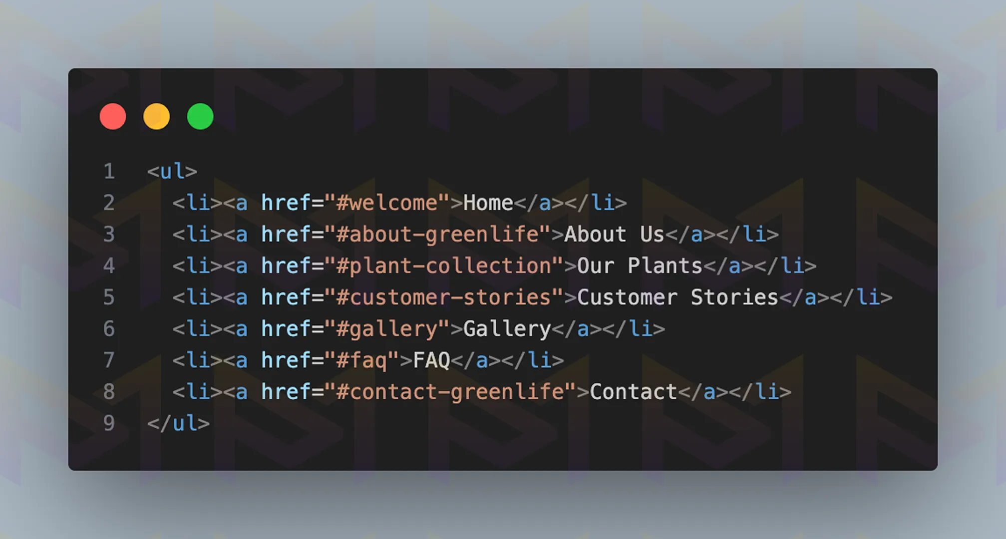
When you click a link, it takes you to the section specified in the href attribute. Remember to add an id attribute with a value that matches the href value. Also, do not forget to include the # symbol before the value.
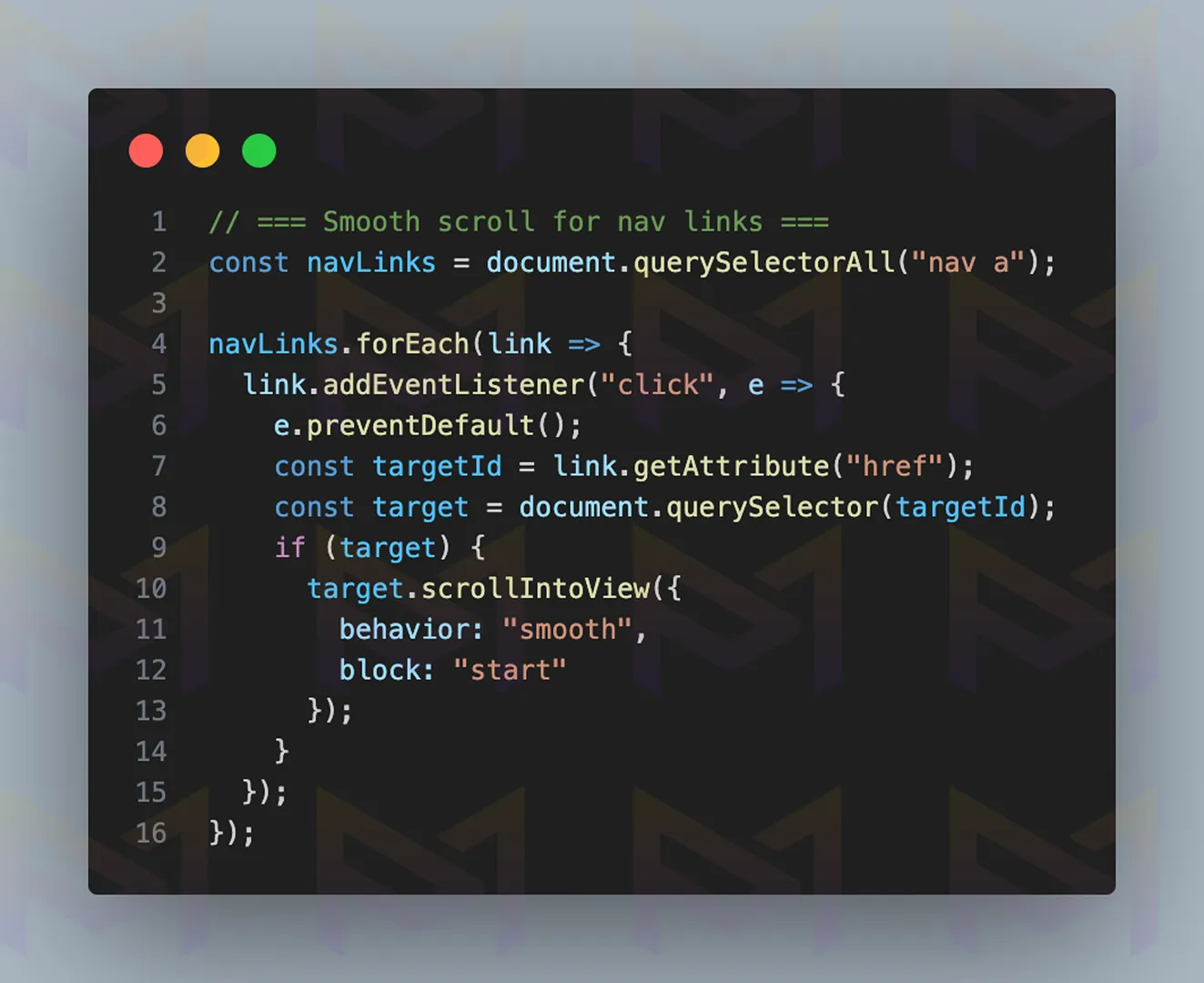
scrollIntoView() is a JavaScript method that scrolls an element into the visible area of the browser window. It can be customized with options such as behavior: “smooth” and block: “start” | “center” | “end” | “nearest”. Use it for interactive navigation or triggered animations. For a polished effect, call element.scrollIntoView({ behavior: “smooth”, block: “start” });.
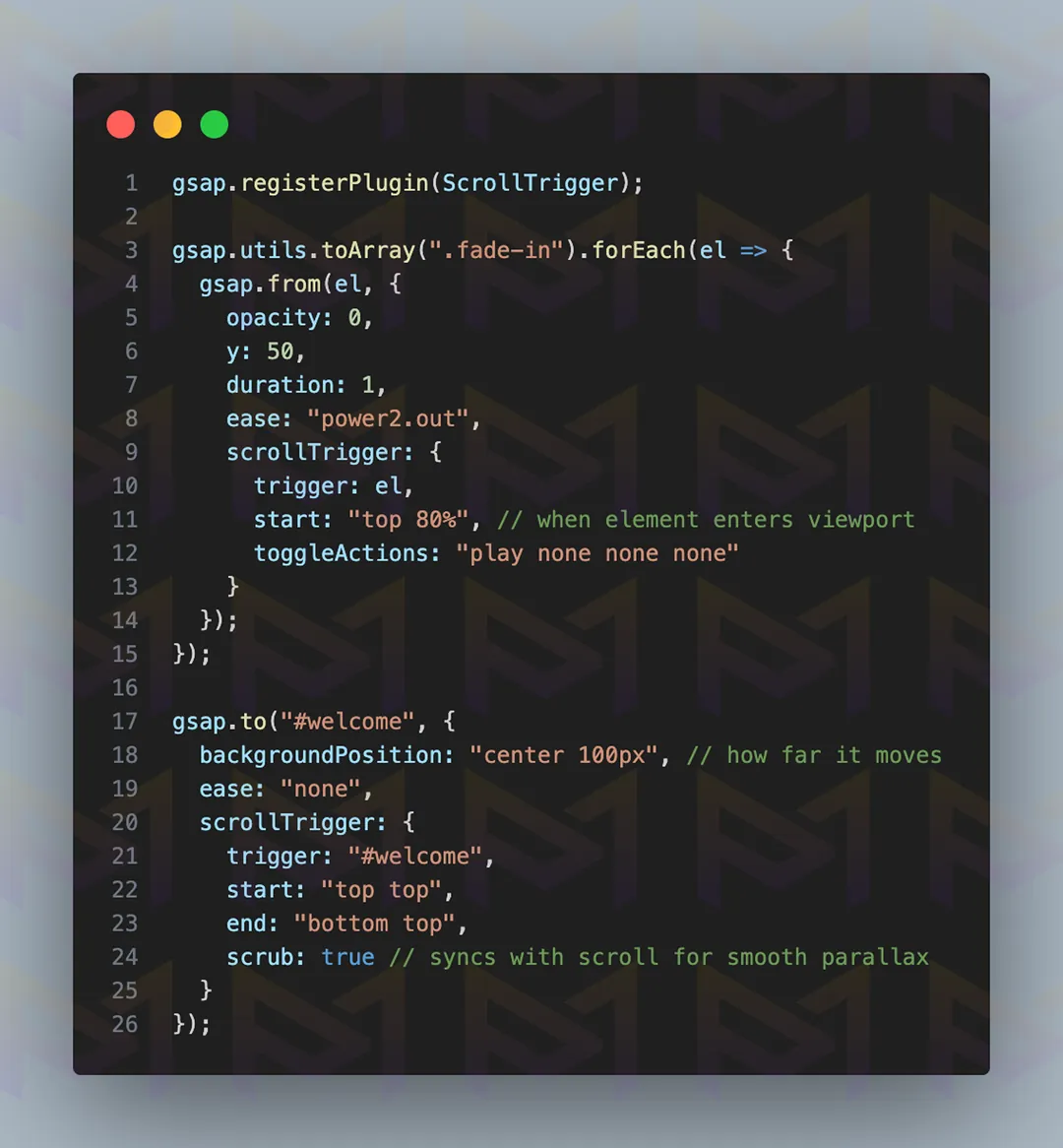
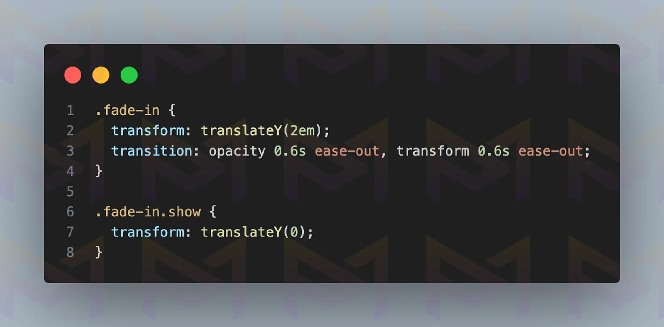
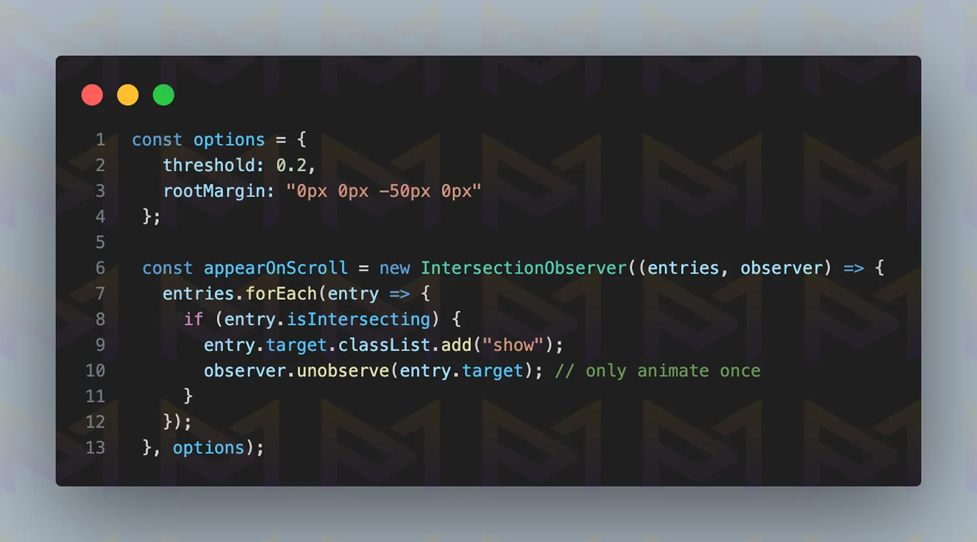
Elements with the .fade-in class animate in (opacity from 0 to 1 and Y from 50 to 0) when they scroll into view. The #welcome section’s background shifts vertically with scroll (backgroundPosition) for a parallax effect, synced smoothly with scrub: true.
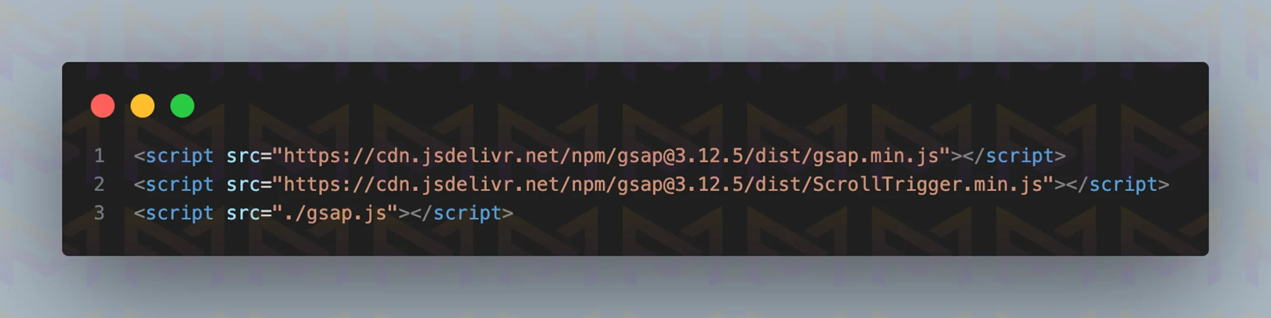
Add HTML <script> tags to include the GSAP and ScrollTrigger libraries via CDN, and link your local gsap.js file.
Image: The website displayed on a desktop screen
Image: The website displayed on a mobile screen
Smooth scrolling improves the flow of long pages, blogs, or product catalogs. It is also one of the easiest effects to implement, often requiring only a few lines of code.
Beyond smooth motion, designers are now exploring new scroll patterns that define modern web experiences and shape how users interact with content.
Trending scroll patterns include parallax layers for depth, scrollytelling for narrative flow, infinite scrolling for continuous feeds, smooth scrolling for fluid motion, and scroll snapping for structured navigation, shaping modern web interactions.
Modern websites no longer rely on plain vertical scrolling. Designers now use trending scroll patterns that reshape how users interact with content. Each pattern serves a distinct purpose and enhances user engagement.
Parallax scrolling remains popular, giving depth by moving backgrounds slower than foregrounds. It creates a cinematic, layered feel ideal for portfolios and campaigns.
Scrollytelling has gained traction in journalism and education, where each scroll reveals new sections of a narrative, transforming reading into an interactive experience.
Infinite scrolling is a staple for social platforms, keeping visitors engaged with endless content feeds. While great for discovery, it requires careful balancing to avoid overwhelming users.
Smooth scrolling, powered by CSS or JavaScript, ensures fluid transitions between sections, making navigation feel natural.
Another trending technique is scroll snapping, which locks each section neatly into view. This works especially well for presentations, slides, or product showcases where clarity and structure matter most.
| Scroll Pattern | Purpose | Common Usage |
| Parallax | Depth illusion | Portfolios, campaigns |
| Scrollytelling | Narrative flow | News, education |
| Infinite Scroll | Endless discovery | Social media, blogs |
| Smooth Scroll | Fluid motion | General navigation |
| Scroll Snapping | Structured browsing | Slides, showcases |
When implemented thoughtfully, these scroll patterns make websites feel modern, engaging, and user friendly.
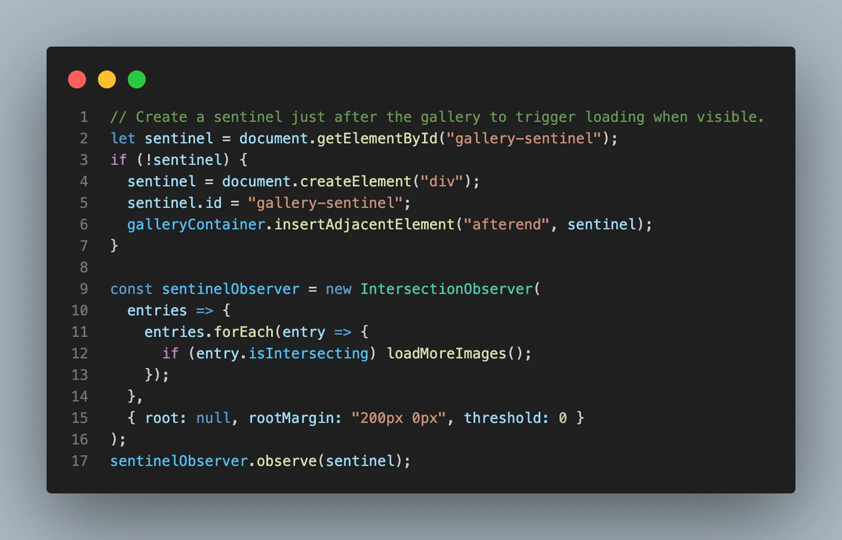
One pattern deserves special focus for content heavy sites: continuous loading of new items as the visitor reaches the end of the page, commonly known as infinite scrolling.
Infinite scrolling is a technique where new content loads automatically as users reach the bottom of a page. You can build it by structuring containers in HTML, detecting scroll position with JavaScript, and fetching data dynamically.
Infinite scrolling is widely used on social media and content-heavy platforms. It creates a continuous feed, encouraging users to stay longer. Instead of clicking through multiple pages, visitors explore seamlessly. To implement this pattern, follow the steps below to build infinite scroll.
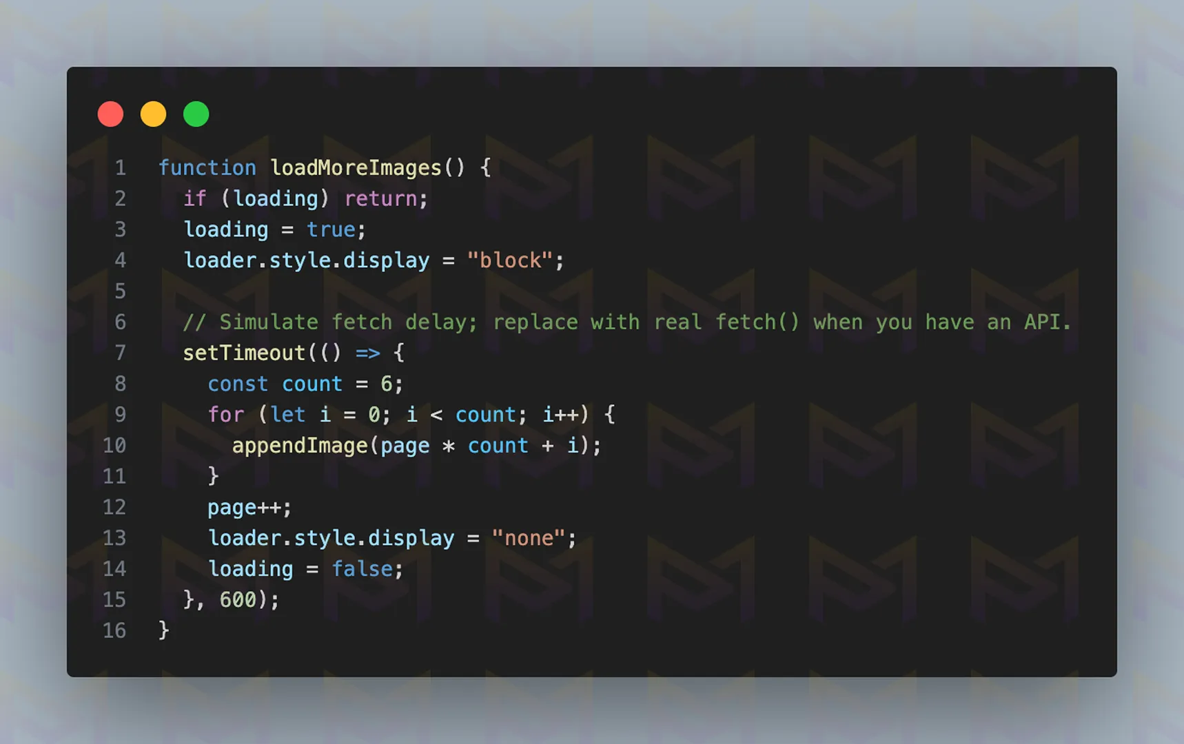
It uses a fake delay and random images. However, instead of setTimeout and placeholder.photos, you would fetch data from a server or API.
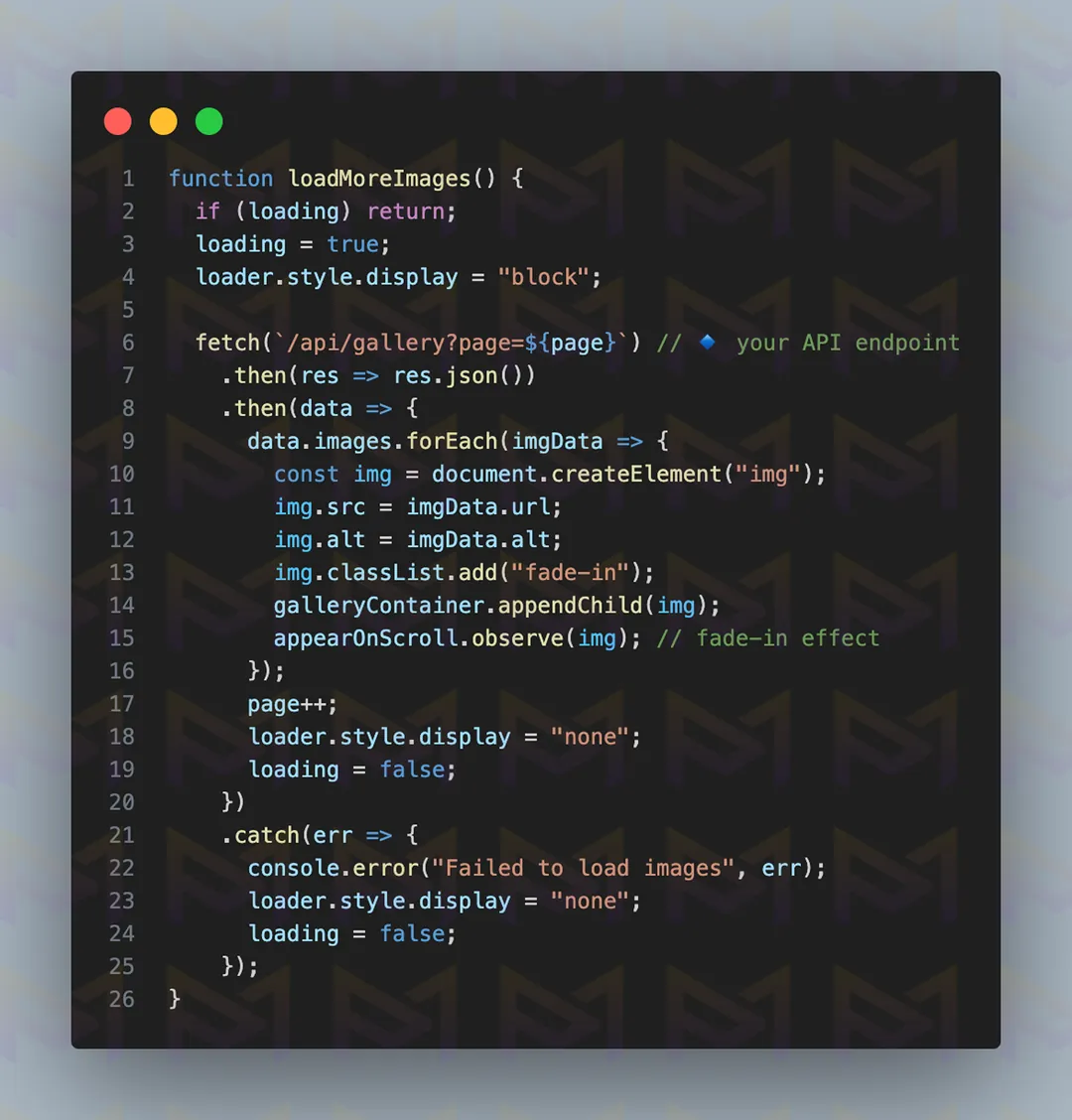
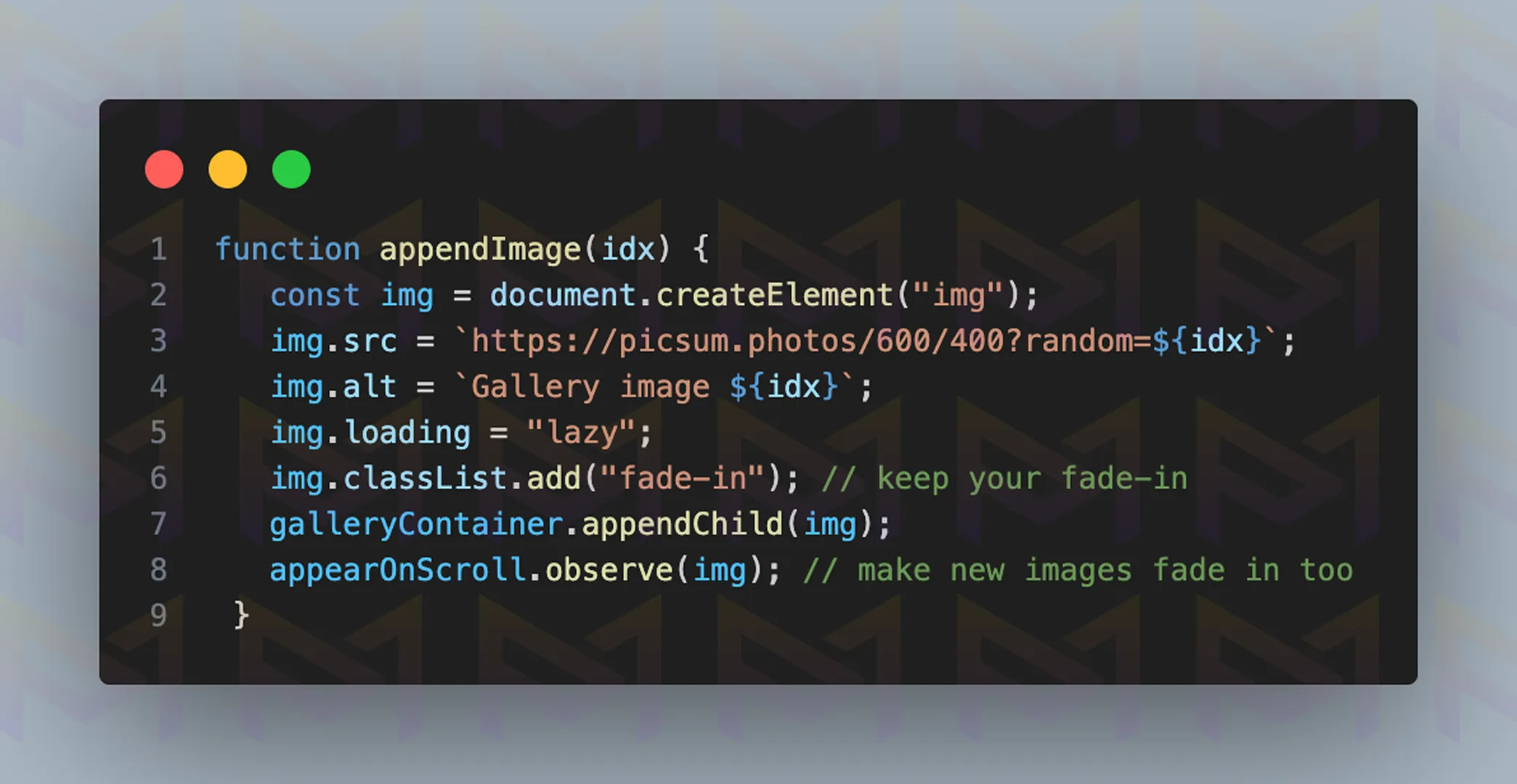
Image: The website displayed on a desktop screen
Image: The website displayed on a mobile screen
A well-structured infinite scroll setup ensures that new content feels natural and uninterrupted. Each step adds to the overall fluidity, making the experience smooth while keeping users engaged with fresh material.
| Pros | Cons |
| Increases engagement time | Difficult for search engine optimization |
| No clicks required | Can overwhelm users |
| Works well for feeds | Harder to navigate to specific items |
To balance usability, include a footer or “Load More” button fallback. This gives visitors the choice to pause or navigate directly, ensuring a smoother experience.
Another approach to improving usability is keeping important elements visible with sticky scroll features.
Sticky scroll elements remain fixed as users move down a page, ensuring menus, headers, or call-to-action boxes are always visible. They improve navigation, boost conversions, and provide quick access to important features without interrupting browsing.
Sticky elements improve usability. A sticky navigation bar ensures visitors can always reach key sections. Call-to-action buttons remain in view, increasing interaction rates.
These effects are particularly useful for e-commerce and long-form content. To implement them cleanly, follow the steps below to create sticky elements.
Check how sticky elements behave in sections with varying heights. This ensures they remain functional and do not overlap or disappear unexpectedly.
When done correctly, sticky elements provide constant access to important tools without forcing users to scroll back. This creates a smoother browsing journey and increases the chance of interaction with key
| Element | Best Use Case | Benefit |
| Sticky header | Navigation | Keeps menus accessible |
| Sticky call-to-action | Marketing | Boosts conversions |
| Sticky sidebar | Content | Quick reference |
Sticky elements should enhance, not obstruct. Keep their size small and ensure they do not block main content.
Proper balance improves the user experience without distraction. Another way to keep visitors engaged is by revealing content through scroll-triggered animations that activate as users move down the page.
Scroll-triggered animations improve engagement by revealing elements as they enter view. They guide focus with fades, slides, or rotations, making content feel dynamic, holding attention longer, and encouraging users to keep exploring the page.
Animations triggered by scrolling make websites feel alive. They reveal content step by step, helping users stay focused.
The effect also reduces clutter since elements only appear when needed. To build scroll-triggered animations, follow the steps below.
These animations should be subtle. Fades and slides work best for text-heavy websites, while zoom effects highlight images. Libraries such as Animate On Scroll reduce development time and ensure smooth performance across devices.
For layouts that demand precise control, scroll snapping ensures each section locks neatly into place for a structured browsing experience.
Scroll snapping is a design effect that locks sections into place as users scroll, creating clean and structured navigation. It should be used for portfolios, presentations, or product showcases where clarity and controlled movement are essential.
Scroll snapping works like flipping through slides. Instead of free scrolling, each section locks into position. This creates a professional, controlled flow ideal for portfolios or product showcases. To implement it on your site, follow the steps below to add scroll snapping.
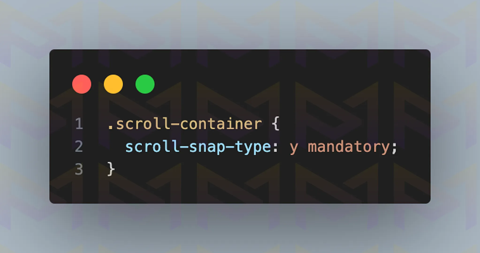
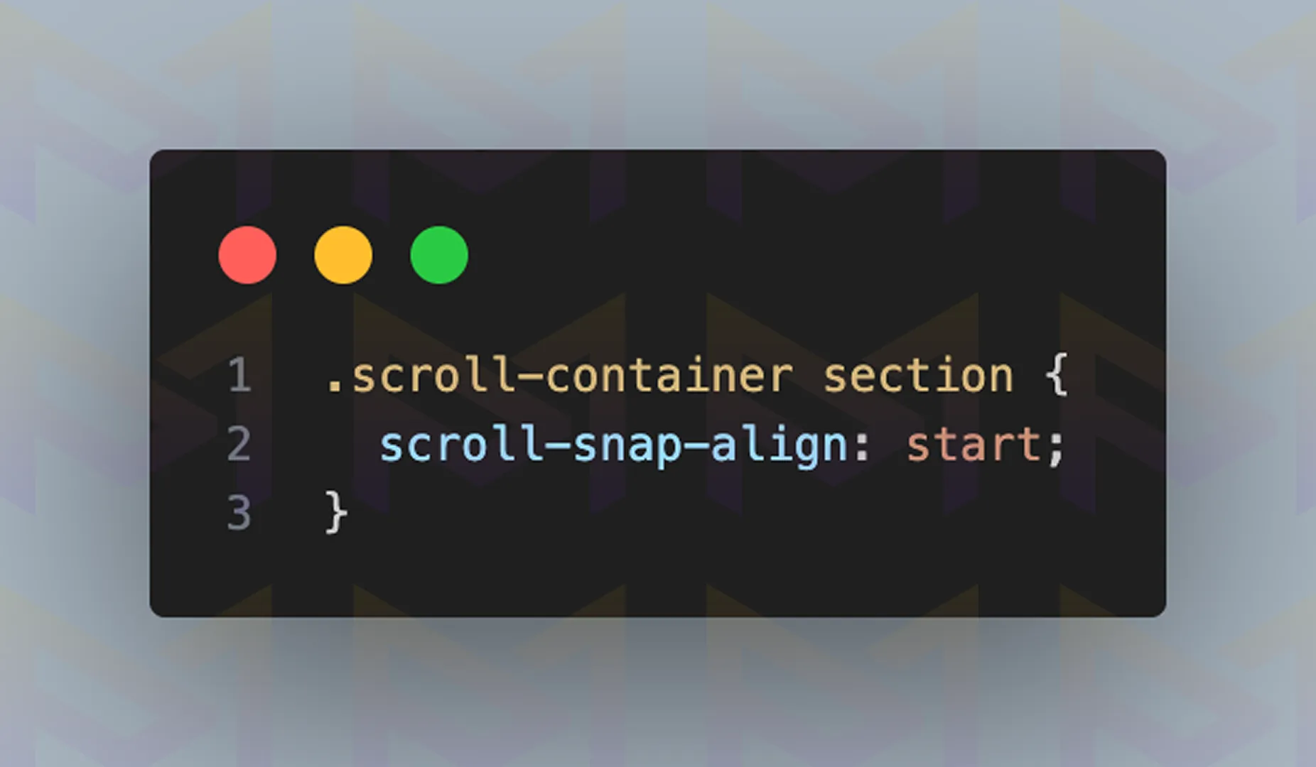
Image: The website displayed on a desktop screen
Image: The website displayed on a mobile screen
By following these steps, designers can create layouts that feel structured and intentional. Scroll snapping removes guesswork from navigation and ensures every section receives equal focus from the user.
| Snap Type | Effect | Use Case |
| Mandatory | Forces alignment | Presentations, product pages |
| Proximity | Gentle alignment | Blogs, content-heavy layouts |
Scroll snapping works best when content is divided into clear sections. It keeps users engaged while ensuring content is always aligned correctly.
Beyond user interaction, scroll effects also play a role in search engine optimization by influencing performance, readability, and engagement signals.
Scroll effects impact search engine optimization by increasing time on site and engagement when used well. To boost rankings, they must be optimized with lightweight code and fast loading, since slow or cluttered effects can harm performance and visibility.
Search Engine Optimization is influenced by performance, readability, and engagement. Scroll effects can increase dwell time since users stay longer when websites feel interactive.
However, heavy scripts can slow down loading, which negatively affects rankings.
Search engines such as Google measure user experience signals. When scroll effects enhance clarity and improve engagement, they indirectly support rankings.
If effects make content unreadable or block important text, search visibility suffers. To keep your site engaging and crawlable, the best practices for SEO with scroll effects are outlined below.
When designed correctly, scroll effects make a website modern while still search engine friendly.
Achieving that balance is easier with well supported tools, including GreenSock Animation Platform, ScrollMagic, Locomotive Scroll, and Animate On Scroll.
JavaScript libraries like GreenSock Animation Platform, ScrollMagic, and Locomotive Scroll provide advanced tools for scroll effects, enabling precise control, storytelling, and immersive designs.
Libraries simplify complex effects. GreenSock Animation Platform offers timeline-based animations with powerful customization.
ScrollMagic syncs animations with scrolling, perfect for interactive narratives. Locomotive Scroll adds inertia-based smoothness to layouts.
| Library | Best Feature | Ideal Use |
| GreenSock Animation Platform | Timeline animation control | Advanced effects |
| ScrollMagic | Scene triggers | Storytelling websites |
| Locomotive Scroll | Smooth inertia | Creative portfolios |
These libraries add performance weight, so optimization is critical. Developers often compress scripts, enable lazy loading, and minimize requests.
When used wisely, they create striking websites without compromising speed. To avoid common pitfalls, it is important to understand the mistakes that reduce the effectiveness of scroll effects.
Mistakes to avoid with scroll effects include overusing animations, which slow websites, and placing effects where they distract from content. Avoid poor testing and unresponsive design, especially on mobile, to keep sites professional and user friendly.
Common mistakes include applying too many effects, making the website feel busy instead of smooth. Another issue is ignoring mobile performance. An animation that looks great on a desktop may lag on smartphones.
Unclear goals also weaken design. Adding effects just because they look nice reduces usability. Scroll effects should serve a purpose: guiding attention, telling a story, or highlighting content. The mistakes to avoid are outlined below.
Avoiding these mistakes ensures scroll effects improve the experience instead of frustrating users.
Scroll effects use CSS and JavaScript to animate navigation, guide attention, and enhance websites. From parallax to smooth scrolling, they create engaging, modern experiences that feel interactive and professional.
Scroll effects turn simple movement into memorable journeys. By combining clarity with creativity, developers capture attention and keep users engaged. Balanced use ensures sites feel fast, interactive, and visually appealing.
Scroll effects turn visuals into meaningful interactions users remember. Let us design a WordPress website for you that performs, engages, and drives lasting business value.