
People do not read websites word by word. They skim, scroll, and look for sections that help them understand the page quickly. When everything blends together, important information gets skipped. This is where content boxes matter.
Content boxes help break long pages into readable parts. They highlight key messages, guide attention, and improve layout without adding plugins. In WordPress, content boxes are often created using simple CSS instead of page builders or bloated tools.
Many site owners rely on plugins to create boxes, alerts, or cards. This works, but it adds extra files, scripts, and maintenance. A cleaner approach is to use CSS directly. It loads faster, gives full control, and avoids conflicts during updates.
CSS based content boxes work with any theme. They can be reused across pages and styled consistently. Once set up, they become part of the site structure instead of a temporary fix.
Well structured CSS layouts are a common practice in performance focused WordPress builds. They reduce complexity, improve readability, and keep the site stable as content grows.
This guide explains how to create content boxes in WordPress using CSS, how they work, where to add the code, and how to use them correctly across your site.
Content boxes in WordPress are created by adding CSS styles and applying them to elements using classes. This is done by writing CSS rules, assigning a class to a block or HTML element, and letting WordPress render the box consistently without plugins.
Content boxes in WordPress begin with structure. In the block editor, you can add a Group block, which acts as a container. In the Advanced settings, assign a class name such as content-box. This creates a reusable styling hook.
If you prefer direct control, use a Custom HTML block. Wrap your content in <section> or <div> and apply the same class. Inside the wrapper, you can insert headings, text, links, or images. This combination of HTML structure and CSS styling makes the box adaptable.
Here is an example of a simple content box:
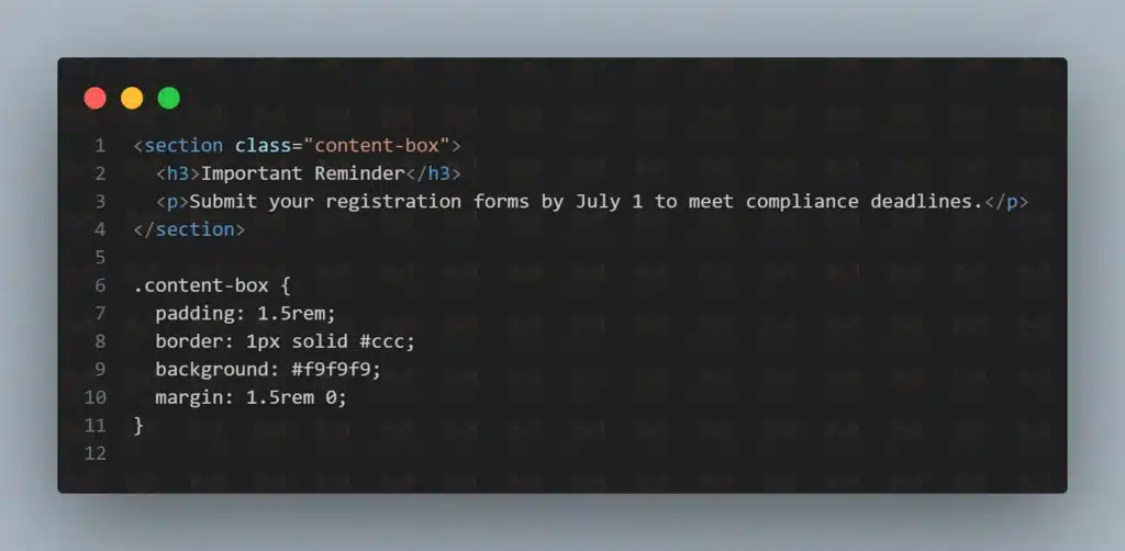
This snippet introduces a light background, spacing, and a border. Any text placed inside the wrapper is framed consistently. By reusing the same class, you create a pattern that scales across your website.
Consistency is the key advantage here. Every box styled with the class looks the same, which keeps your site professional and predictable. Now that we know how to create one, let’s define exactly what a content box is and why it matters.
A content box is a styled container that frames related information with padding, borders, and background. In WordPress, it can be built with a Group block or HTML wrapper and styled using CSS.
A content box is a design element that visually separates information from the rest of a page. It places text or media inside a framed section with spacing, a border, or a background. The purpose is to highlight details without overwhelming the reader.
You can improve readability and visual clarity by letting us structure content boxes as part of the design system. We create clean layouts that highlight key information without clutter or layout conflicts.
In WordPress, you can create a content box using either the block editor or HTML. The block editor method uses a Group block. This container allows you to insert headings, text, or images. By assigning a custom class such as content-box, you can then control styling with CSS.
The HTML method uses a wrapper element like <section> or <div>. By applying the same class, you can style multiple boxes with a single CSS rule. This ensures your design remains reusable and consistent across the entire website.
One of the clearest ways to understand the value of a content box is by comparing it to plain text. The table below demonstrates how unframed content differs from content presented inside a box.
| Layout Style | Reader Impact |
| Plain text only | Important points blend into long paragraphs |
| Text inside a box | Key details stand out, improving scanning |
This comparison shows that content boxes guide attention and make details easier to process. Instead of blending into the page, key information stands out clearly.
Here is a short code example showing how to create a content box:
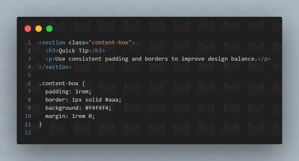
This code adds padding for spacing, a border for framing, and a soft background for contrast. Any content inside appears highlighted, signaling importance to readers.
Now that we know what a content box is, the next step is to understand why it matters and what benefits it provides for both users and site design.
Content boxes matter because they reduce cognitive load, highlight important details, and make pages easier to scan. By grouping key points, they improve comprehension, support accessibility, and create consistency across WordPress websites.
One of the biggest challenges of online content is that readers rarely consume every word. Instead, they scan, searching for cues. A content box provides those cues by separating important details from regular text.
From an accessibility perspective, content boxes also play a critical role. Properly coded, they help screen reader users move through sections more easily. High-contrast designs and visible focus states ensure users with visual or motor impairments do not miss key information.
This practice is supported by research. The Centers for Disease Control and Prevention (2019) recommends chunking text into smaller sections to improve readability. The Centers for Medicare & Medicaid Services (2022) also advises using short, meaningful chunks for digital writing.
To better understand the effect of chunking, it helps to compare comprehension levels between unbroken paragraphs and structured sections. The chart below illustrates this difference clearly.
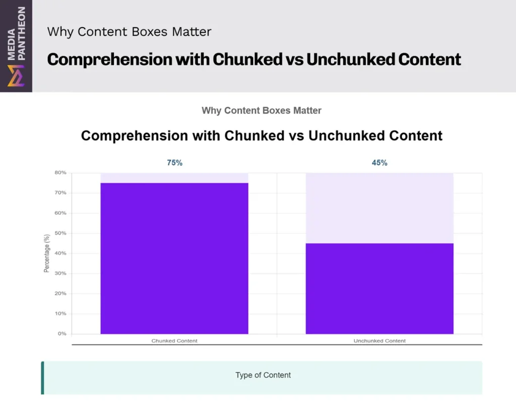
As the chart shows, comprehension improves significantly when content is broken into smaller parts. This demonstrates why content boxes are effective: they reduce cognitive effort, make scanning easier, and help readers retain details.
They also create consistency. If every tip or warning appears in the same type of box, readers quickly recognize the pattern. Familiarity builds trust and speeds up navigation.
By lowering mental effort, boxes allow readers to focus on meaning rather than formatting. They improve flow, clarity, and the professional feel of a page.
With their benefits established, the next step is to explore when content boxes should be used to maximize their impact.
Content boxes should be used when critical information needs attention, such as deadlines, alerts, calls to action, or tips. They are most effective in long guides, tutorials, and official resources where readers need fast access to essential details.
Not all content requires a box. Boxes should highlight information that readers must notice right away. A tax deadline or university registration date, for example, becomes far more visible when framed in a box.
Educational and healthcare resources especially benefit from this approach. A box can highlight academic rules, safety notices, or step-by-step instructions.
The Centers for Disease Control and Prevention (2019) explains that chunking information into smaller, structured units improves clarity and comprehension.
To make these applications clearer, the table below shows common use cases for content boxes, their purpose, and an example of each.
| Use Case | Purpose | Example |
|---|---|---|
| Deadlines | Keep readers on track | FAFSA or tax filing dates |
| Alerts | Emphasize safety | Food safety reminders |
| Calls to Action | Encourage next steps | “Apply Now” or “Download Guide” |
| Tips | Aid learning | Study or writing strategies |
This comparison highlights how content boxes function as signposts, guiding attention where it matters most.
Bullet lists also work well when placed inside content boxes. For example:
Framing details in this way reduces scanning effort and strengthens clarity. Now that you know when to use content boxes, the next step is learning where to place them for the best results.
Content boxes work best when they appear exactly where readers need them most. Placement shapes how messages are seen and acted on, whether that’s delivering urgent updates at the top, guiding readers mid-article, or prompting action at the end.
Critical updates, such as deadlines or alerts, belong above the fold where they are seen immediately. Supporting details, like helpful tips or reminders, fit naturally within the body of an article.
In long tutorials or guides, boxes can serve as pause points. A summary or note inside a box gives readers a break while reinforcing key details.
At the end of a page, boxes make effective calls to action, encouraging the reader to take the next step without scrolling back.
To make the most of content boxes, it helps to match their position with their purpose. The following guidelines show how different placements serve readers in specific ways:
This can also be compared visually by looking at common placement patterns. The table below shows how each position serves a specific purpose and provides an example of the type of content that benefits most from that location:
| Placement | Purpose | Example |
| Top of page | Immediate visibility | Submission deadline |
| Mid-content | Reinforce learning | Study tip inside tutorial |
| Bottom | Drive next steps | Apply Now button |
| Beside the forms | Prevent errors | List of required documents |
Placing a content box thoughtfully ensures it feels like part of the reading journey, not an interruption. Each box should support the flow and catch attention at the moment it is most useful.
With placement clear, the next question becomes who benefits most from creating and maintaining these content boxes.
Content boxes should be created by publishers, designers, educators, healthcare professionals, and administrators. They are especially valuable for government agencies, schools, and businesses where highlighting deadlines or promotions builds clarity and trust.
Content boxes are not limited to developers. Anyone who manages online information can build them. Educators use boxes to emphasize exam dates, due dates, or grading criteria. Healthcare providers rely on them for safety instructions or preparation checklists.
Government agencies often benefit because regulations and deadlines must be clear. Research from the National Center for Education Statistics (2017) shows that digital learning improves when content is organized into smaller, structured sections. Content boxes apply that principle by making rules and requirements more visible.
You can ensure these content boxes remain clear, consistent, and error free by having them implemented as part of a structured website build. Proper design, clean code, and long term maintenance keep important information visible without layout issues as content grows.
Businesses also find value in content boxes. A framed promotion or service detail stands out without cluttering the page. For small teams or independent publishers, boxes provide a lightweight solution for presenting key points consistently.
To show how different audiences benefit, the table below outlines typical user types, their use cases, and examples.
| User Type | Use Case | Example |
| Educators | Academic schedules | Exam dates or assignment deadlines |
| Healthcare | Safety information | Patient preparation checklist |
| Government | Regulatory updates | Licensing or renewal deadlines |
| Businesses | Promotions | Seasonal sales or special offers |
This table highlights how boxes act as universal signposts across industries. No matter the field, they ensure critical details do not go unnoticed.
With audiences identified, the next logical step is to learn how to build content boxes in WordPress with practical examples of HTML and CSS.
Content boxes can be built with HTML by wrapping text or blocks inside a container element like a div and giving it a class name. The class becomes the hook for CSS, so the box keeps the same spacing, borders, and background anywhere it is used in WordPress.
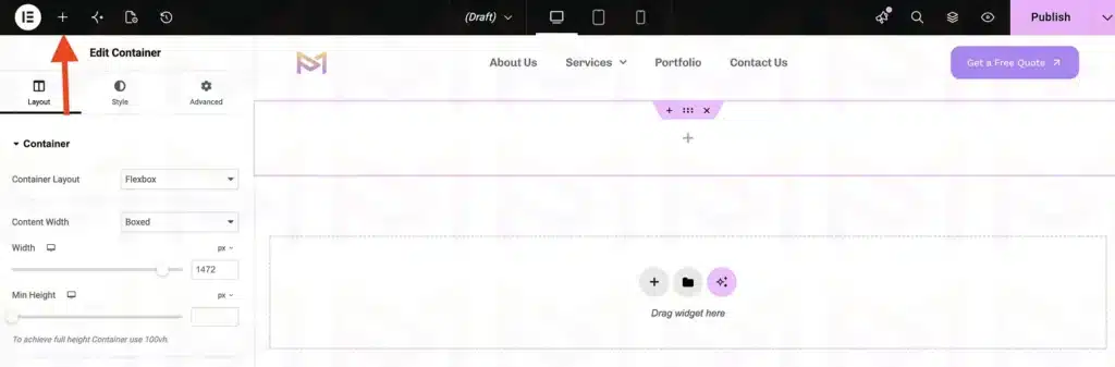
The first step is structure. The image above shows the Elementor editor with the + button used to open the Elements panel.
If you are using the WordPress block editor, insert a Group block.
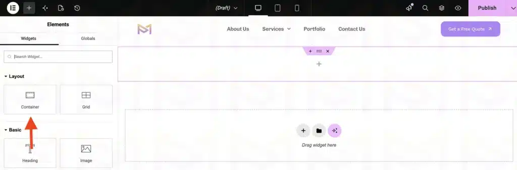
The image above shows the Container widget inside the Elementor Elements panel, ready to be added to the page. This acts as the container for your box.
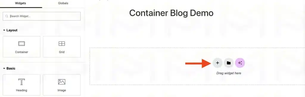
The image above shows an empty container with the + button for adding nested containers or widgets.
In the Advanced settings, assign it a class name such as content-box. Inside, place headings, paragraphs, or links.
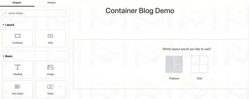
The image above shows the layout selection screen where users can choose between Flexbox and Grid.
If you prefer manual control, use the Custom HTML block. Wrap your content with a <section> or <div> that has the same class. This makes your design consistent, since all boxes with that class will share the same styles.
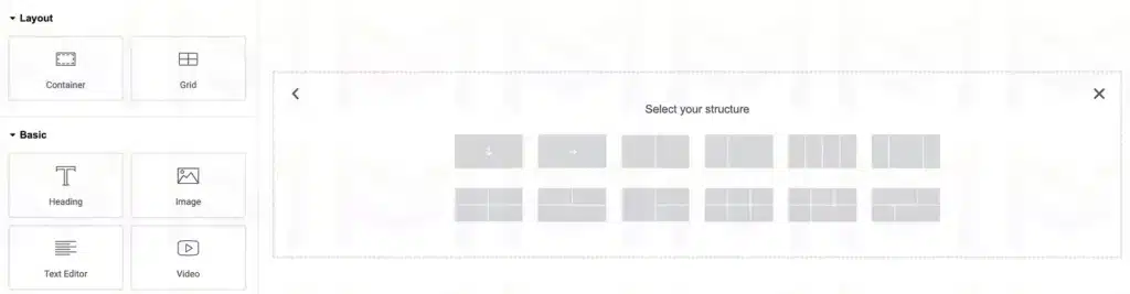
The image above shows the available predefined container structures for creating different column layouts.
Here is an HTML example that shows how a reminder could be presented:
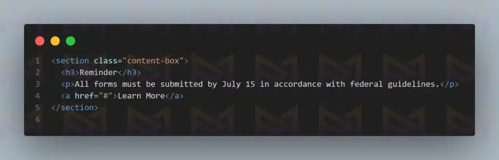
This snippet creates a structured section with a heading, paragraph, and link.
With the building process clear, the next challenge is learning how to troubleshoot issues that can arise when boxes do not display as expected.
If a content box does not display correctly in WordPress, confirm the wrapper class is accurate, check if your CSS load after theme files, and test for plugin conflicts. Inspect code with browser tools to identify and fix errors.
Even with a solid structure, content boxes can occasionally break. The most common issue is a missing or mistyped class name. If the content-box class is not applied correctly, your CSS will never connect. This is often the first step to check.
Another issue comes from stylesheet order. WordPress themes sometimes load their CSS files after yours. This means your rules are overridden by the theme. To check, use browser developer tools, which show which rules are active and which are crossed out. Adjust the order so your CSS loads last.
You can avoid styling inconsistencies by using the proper hosting environment designed for WordPress. Proper asset loading and staging tools ensure CSS changes are tested safely before going live.
Plugins can also interfere. Some add their own styling that may overwrite your boxes. To identify the source, deactivate plugins one by one, refreshing your site after each change.
To make troubleshooting easier, here is a table outlining the most common problems, their symptoms, and the best solutions:
| Problem | Symptom | Solution |
| Wrong class | Box has no style | Verify class matches CSS |
| Load order | Theme overrides CSS | Enqueue custom CSS last |
| Plugin conflict | Box styling changes unexpectedly | Deactivate plugins to test |
| Mobile collapse | Box looks broken on small screens | Add responsive CSS rules |
This table highlights the typical issues you may encounter and provides a direct path to solving them. By following these checks, most problems can be resolved quickly without needing advanced tools.
Finally, always test accessibility. Confirm that focus states are visible and that screen readers interpret your boxes logically. Fixes here not only improve design but also expand usability.
With troubleshooting mastered, we can now conclude by reviewing what content boxes are, why they matter, and how they improve the reader’s experience.
Content boxes in WordPress are created by defining CSS styles and applying them through class names. This method relies on native WordPress features, avoids unnecessary plugins, and keeps layouts consistent while allowing full control over spacing, colors, and structure.
CSS based content boxes provide a clean way to organize information on a page. They improve readability, support accessible layouts, and reduce visual clutter. When implemented correctly, they remain stable across theme updates and content changes.
Using CSS for content boxes keeps WordPress flexible and easier to maintain over time. It reduces dependency on external tools, improves performance, and ensures the site can scale without layout issues.